WATERCAN
The tradition 5 gallon Water Can was sometimes referred to as ‘Buckby Can’ as there was a place at Long Buckby where they were made. Many Narrow Boats had two Water Cans as it was easier to balance two when walking away, think of a Milkmaid carrying milk. They held a Narrow Boats only source of fresh water and were made of galvanized steel. Older cans were made of a heavier gauge steel than the more recent ones.
The water can was used all the time so the pain would wear over a matter of a few years so they regularly had to be repainted.
STAGE 1
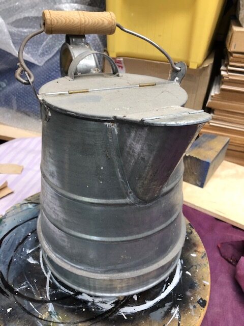
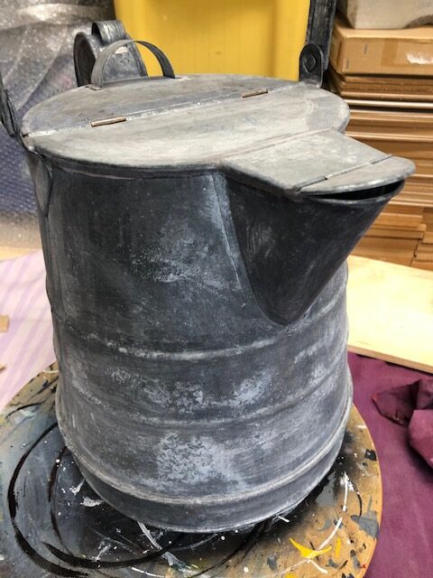
One way to prepare a new item finished with a galvanised surface is to allow weathering to take place out doors for a few weeks. This Water Can had been stored for about 25 years after buying a number of them at the Uxbridge Boat Centre. To make sure it was properly prepared I gave it a coat of etching primer. Etching Primer eats into the surface and produces a 'key'. You know primer has working when the surface turns black. If it does not turn black there might be some grease on the surface that needs washing off first. It is advisable to wash the metal after the primer has been used. Follow instruction when using the primer.
STAGE 2
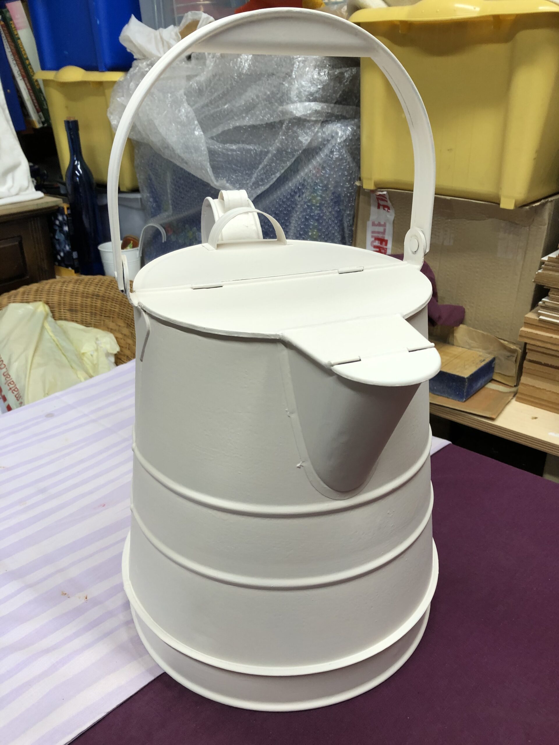
It may be a bit over the top but I cover the etching primer with a coat of white primer. I follow this with a coat of high build 'Craftmaster' undercoat, also white. This can help produce a slightly smoother surface for the next stage. Craftsmaster paints were designed for Narrow Boats as many of the traditional paint manufacturers had disappeared.
STAGE 3
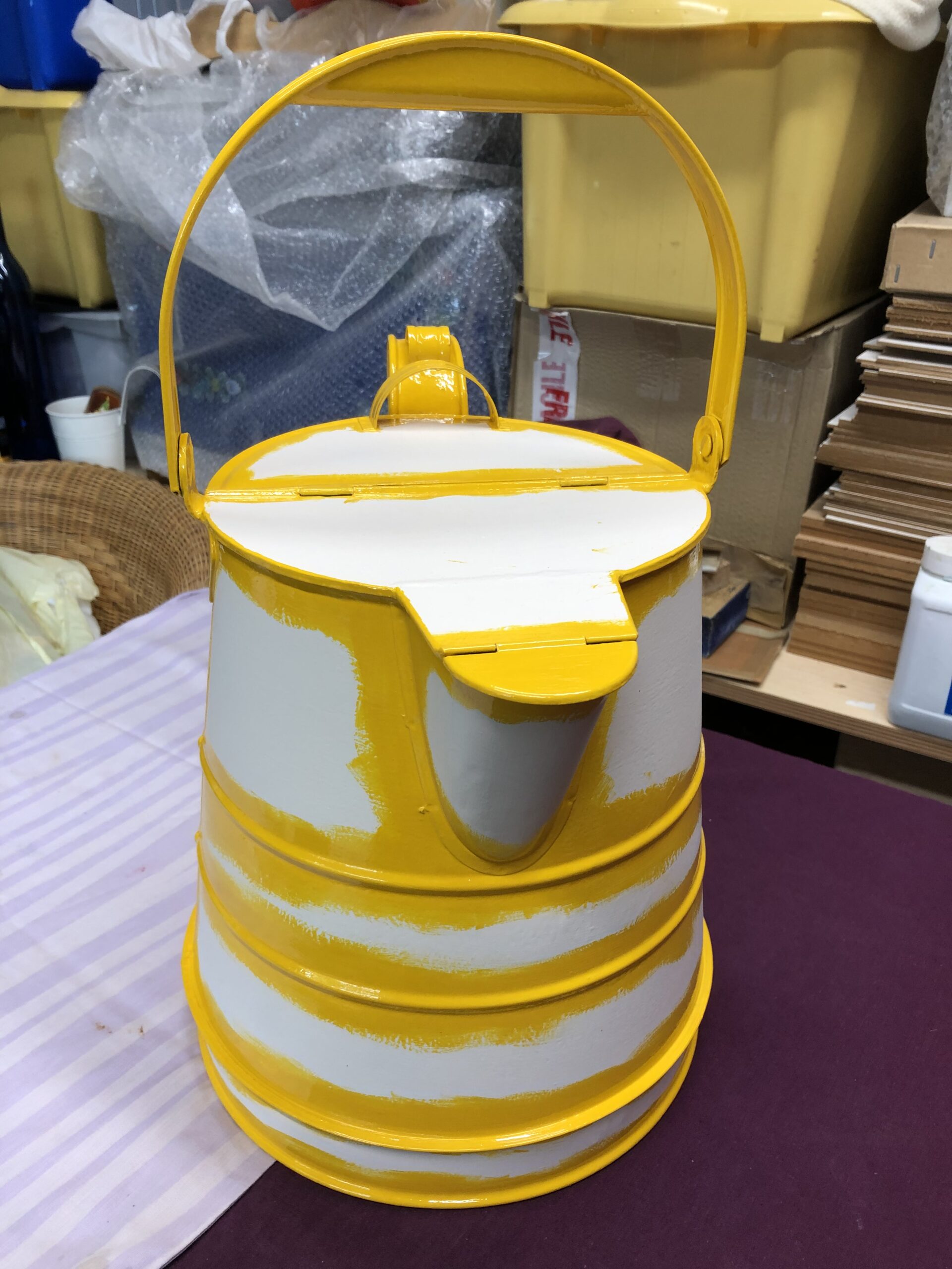
Following the undercoat I paint yellow bands with Coach Enamel, applying two coats of yellow gloss paint. Traditionally the dividing bands were painted after the panels were finished with all the decoration. This was done for speed using single brush stroke to give a quick and clear demarkation between one panel and the next. As the make-up of paints has changed in more recent year, yellow no longer seems to have the same body as it once did, so I put the yellow on first as its easier to paint dark on light rather than light on dark. Others may have a different approach with different reasoning.
STAGE 4
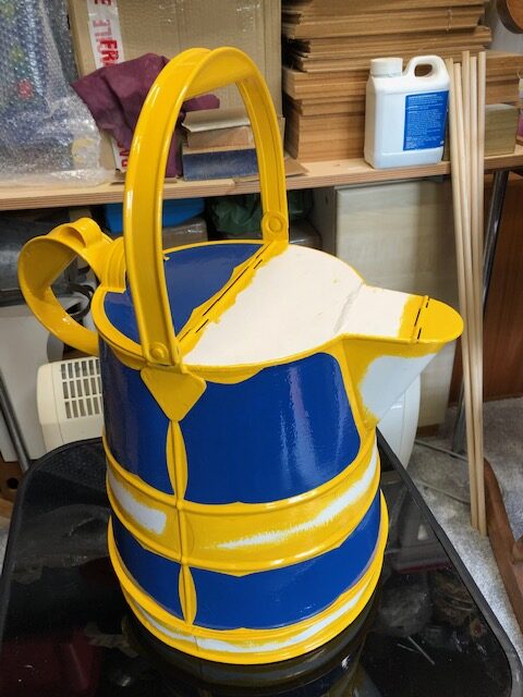
My next stage is to paint the panels that I have selected to be blue. Quite difficult on this can as the metal surface did not have the best of finishes although it was new. I have used 'Craftmaster' Coach Enamel again which has its own coloured undercoat. Some painters just apply two coats off the coloured undercoat as a matt finish gives a better ‘key’ for the decoration thats to follow. The whole thing is going to be varnished at the end so you would be saving on the gloss paint and time.
STAGE 5
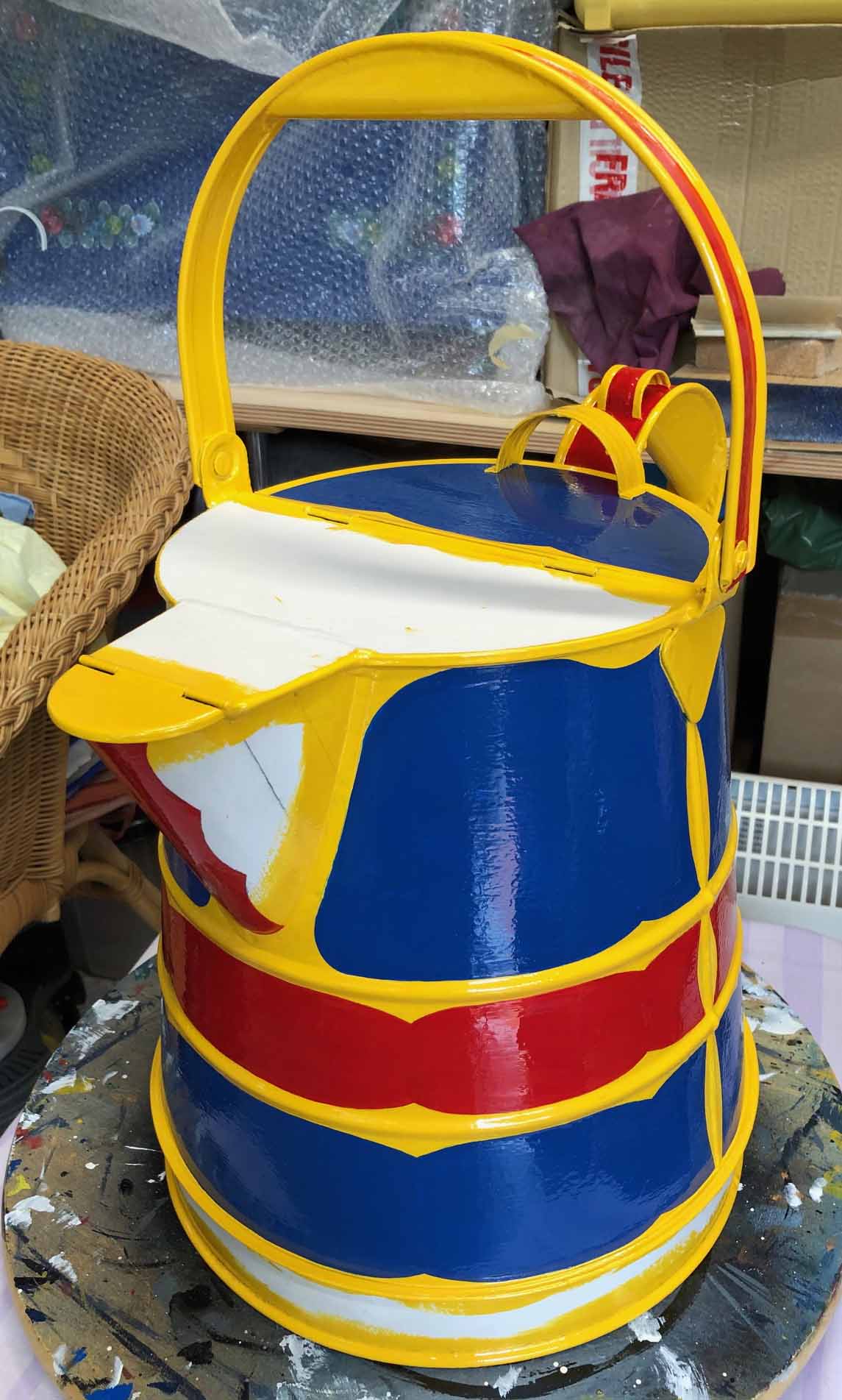
Many years ago I saw a water can on a traditional Narrow Boat at Hawkesbury Junction were the panels had been painted with scalloped edges. I know it’s not traditional but I liked the variation so went down the same route with (in this example) red and blue panels. In this example I did use an undercoat and gloss coat but am now going down the line of a matt background to paint on. In some ways I found it easier to paint curved lines especially as I now find it difficult to keep my hand steady for long straight lines. I also found it easier to paint the panels already having the yellow bands in place.
STAGE 6
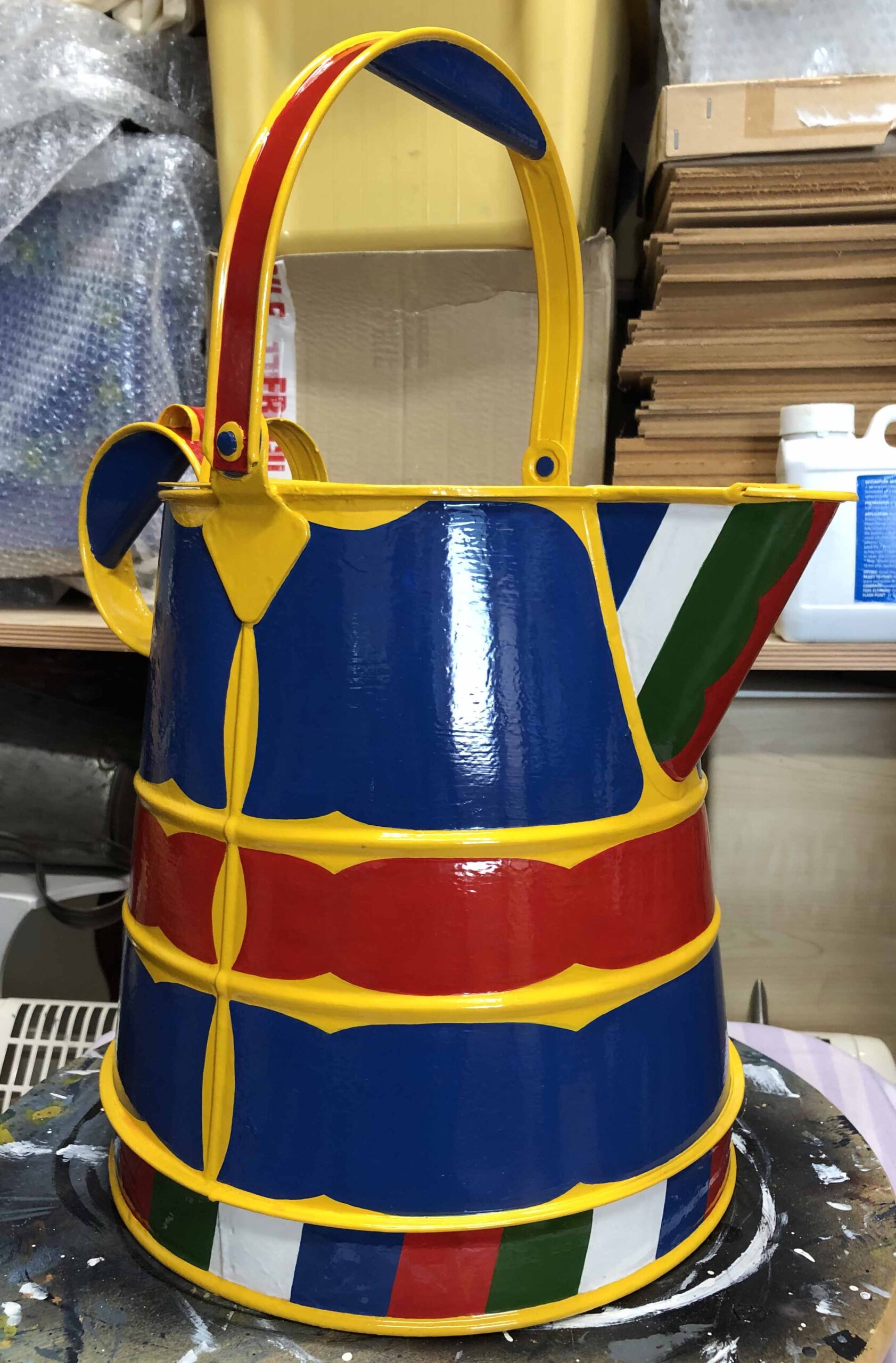
My final stages in painting the background colours are to paint the band around the bottom, the spout and handle. The size of the divisions around the bottom seems to vary from painter to painter, as do the colours. I was once told that the colours round the bottom were defined by the painter using up 'left over' paint. I don’t know if this is true but it sounds plausible. Never waste paint when it can be avoided! They're usually seem to be four different colours, alternating lighter and darker, with the spacing carefully worked out so you don’t end up with an odd number. The spout is another part that does not seem to have any hard and fast rules, the design varying from a single colour to strips.
STAGE 7
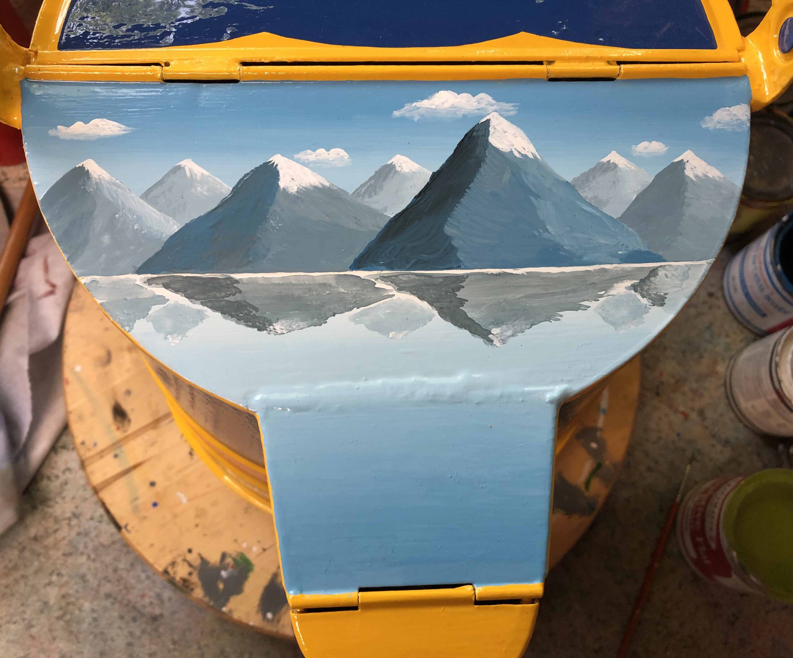
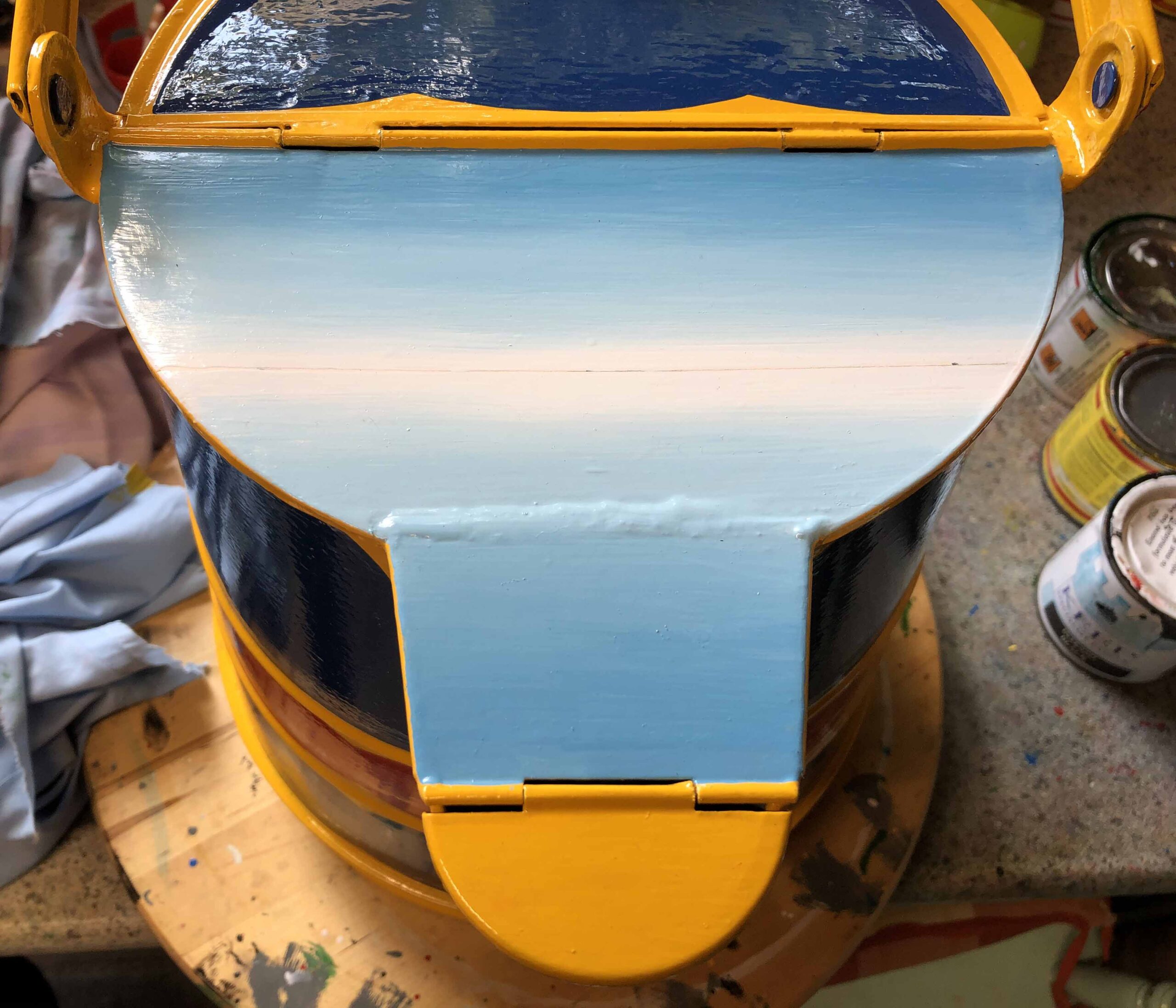
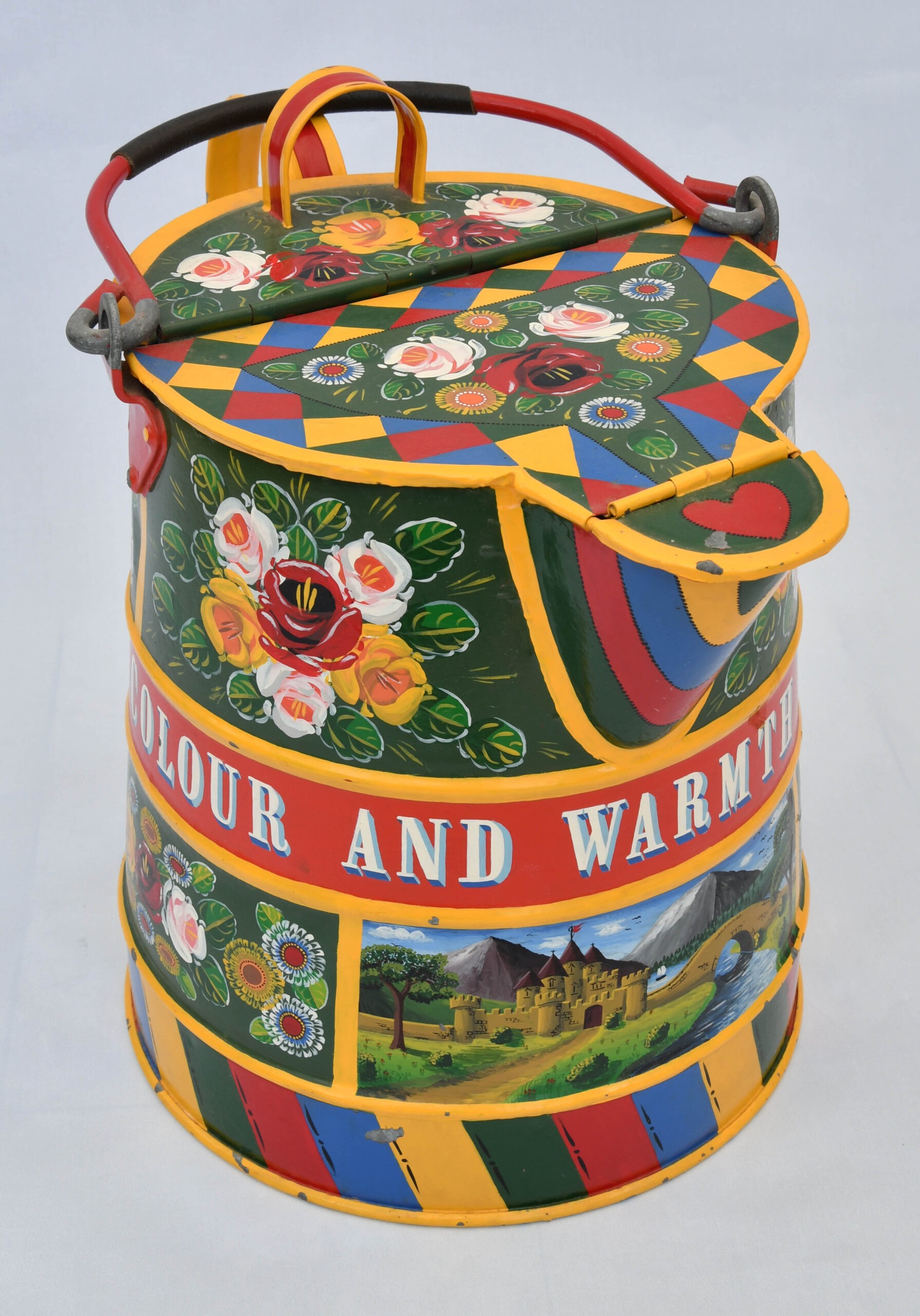
Traditionally one of the panels on most Water Cans contained the representation of a 'Castle Picture'. The position and style can vary from painter to painter and helps distinguish one painter from another. In my example the picture is on the top of the can. The first stage is painting background in horizontal strokes from the sky (in progressively lighter blue) to the horizon (white) and the river (with progressively darker blue).
STAGE 8
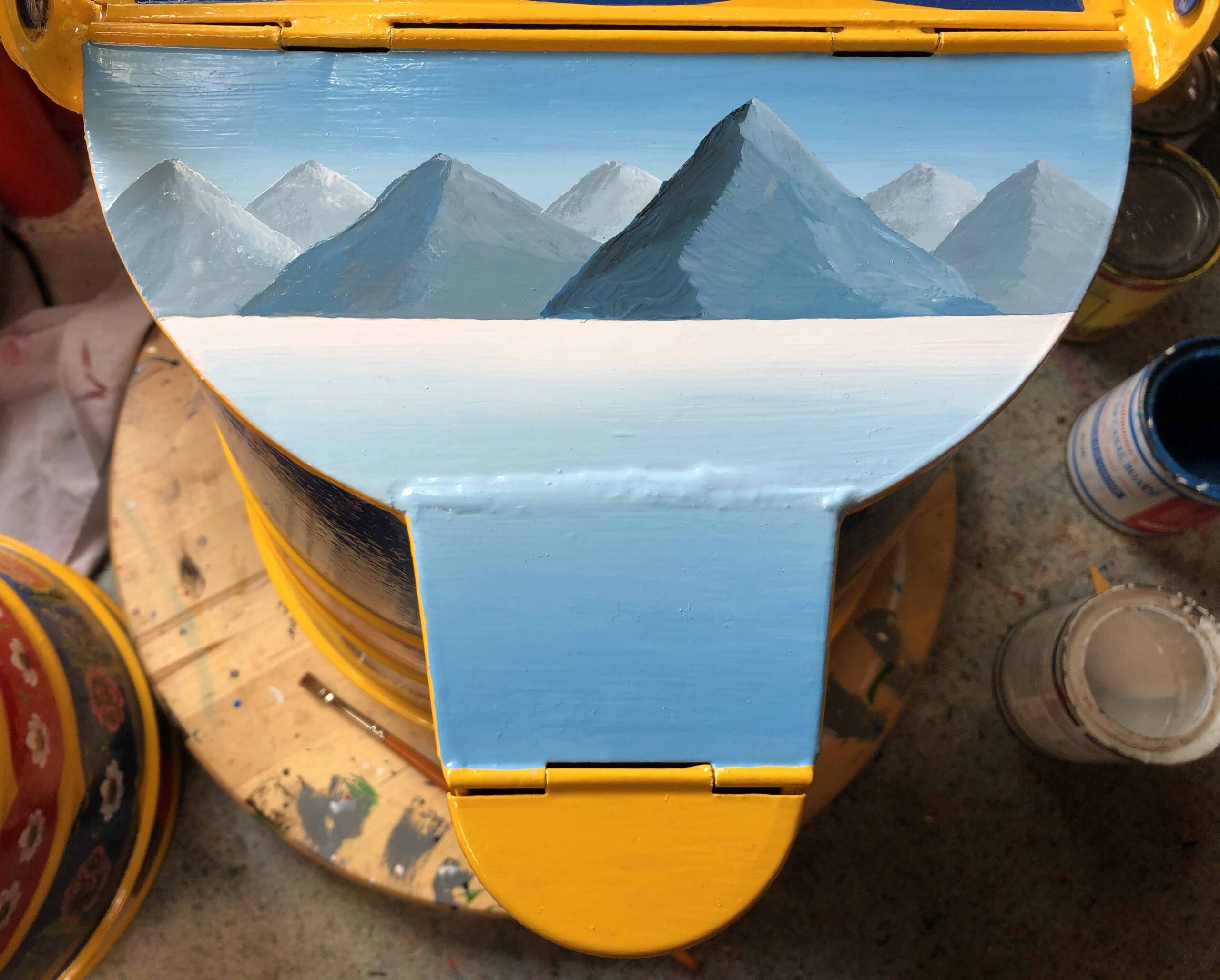
Working just above the half way point the maintains are added. A variety of blue/grey colours are used with lighter ones further back. The mountains start with a background colour which is lightened and darkened for highlights and shadows. Colour schemes and designs vary with each painter. I tend to get carried away with the number of mountains!
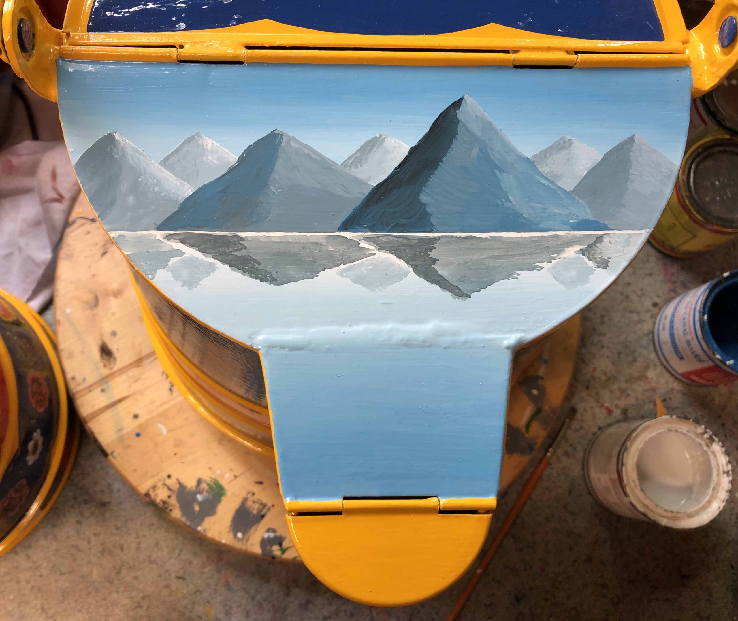
STAGE 11
If required the castle could be drawn out with a Chinagraph pencil. Then block in the Castle and Bridge. I use Bright Yellow with a touch of Red.
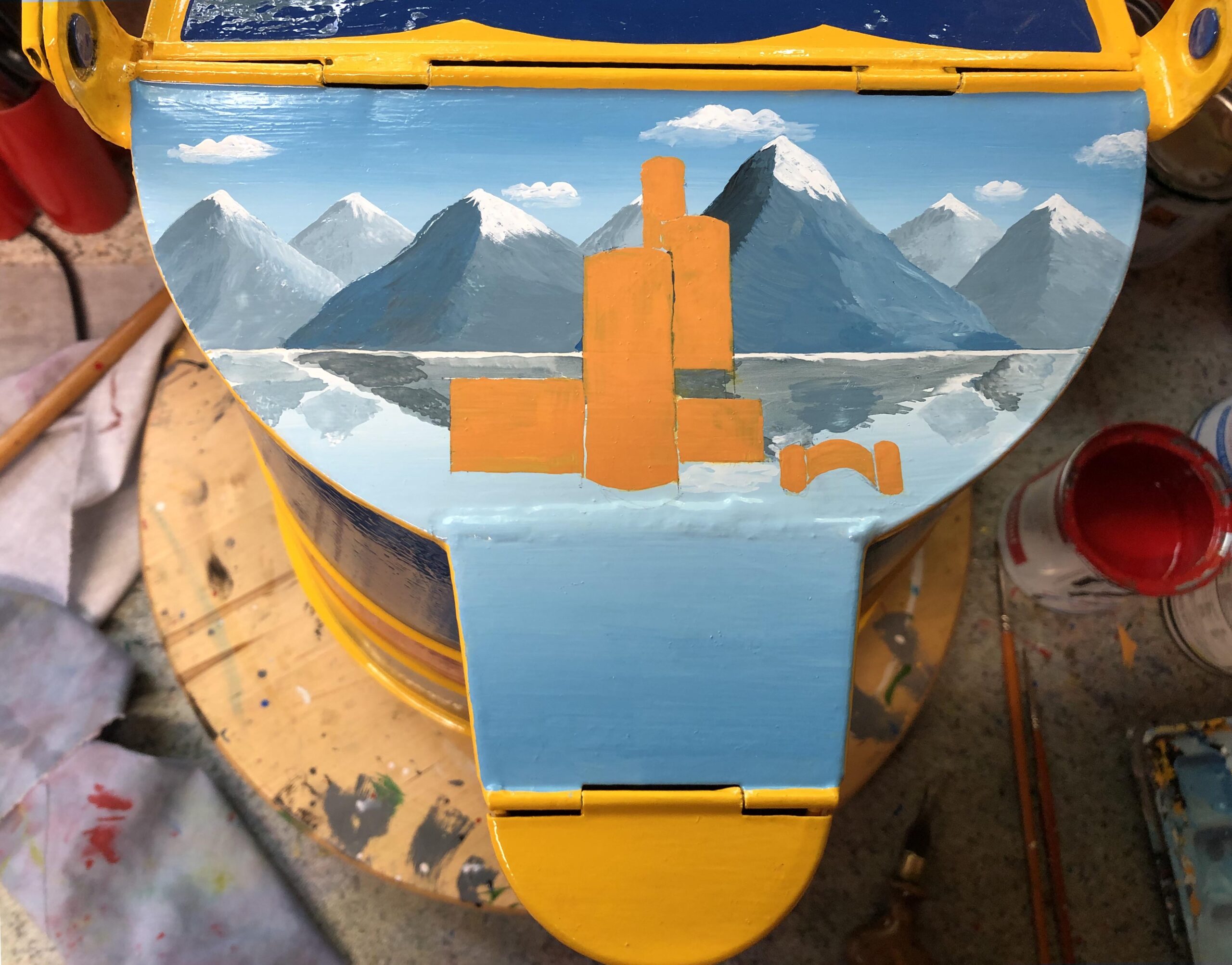
STAGE 12
Shadows and highlights can then be added top the castles and bridge. I add white to the original colour for the highlights and red and a little black to create a darker shade for the shadows.
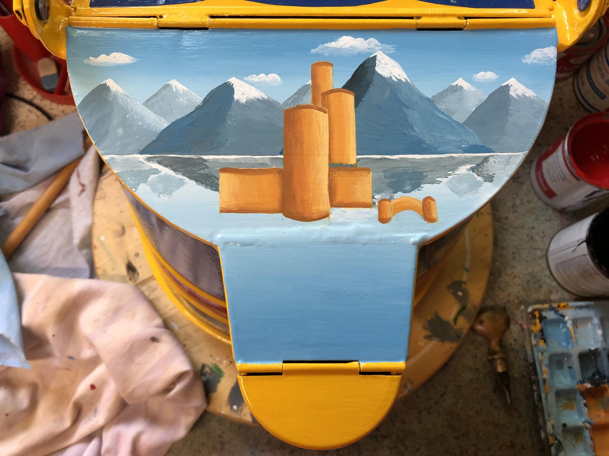
STAGE 13
I block in all parts of the roof and tops to the bridge using bight red. I sometimes use maroon as an alternative.
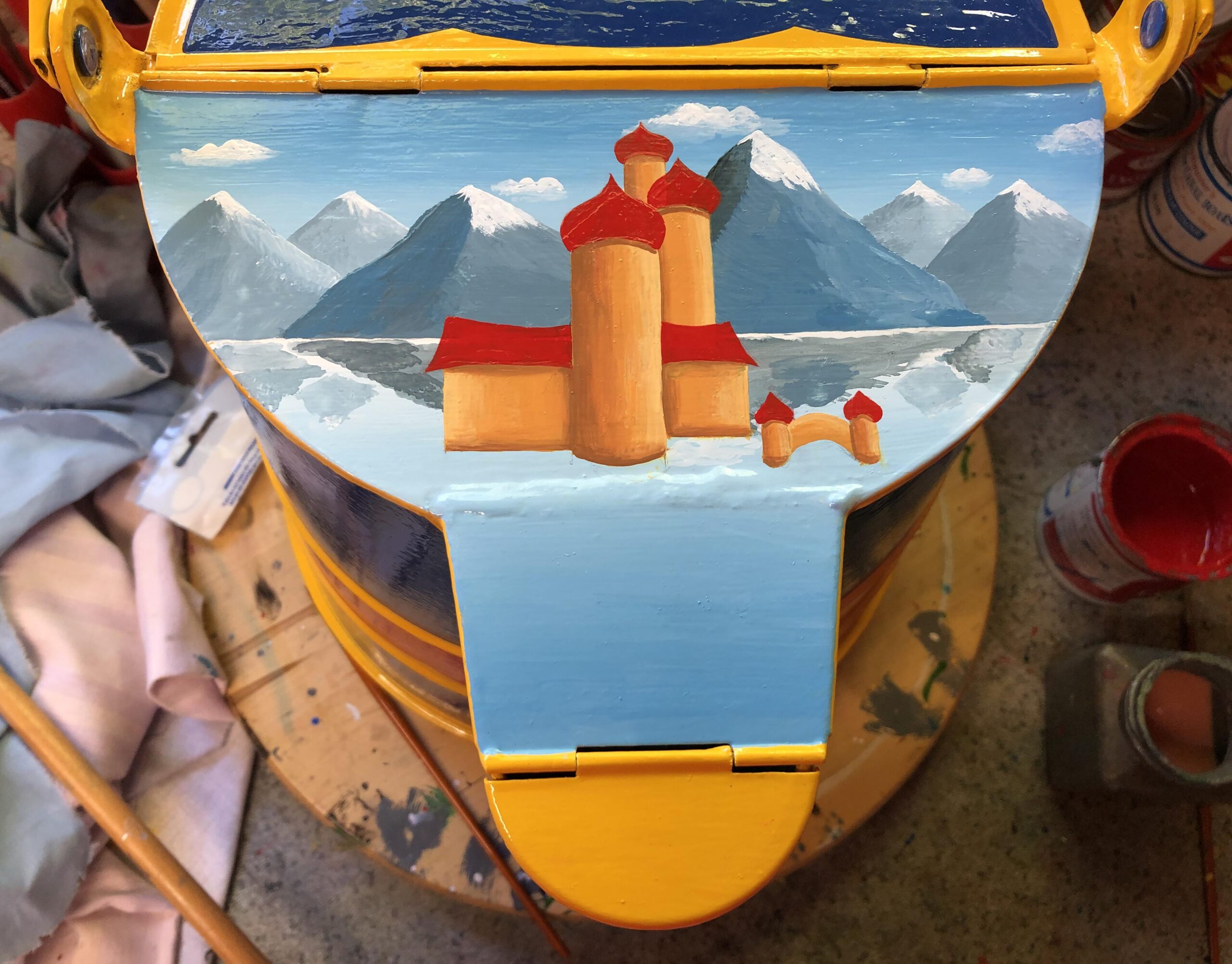
STAGE 14
The roofs then have shadows and highlights added. I used white to the original colour for the highlights and black to create a darker shade for the shadows.
STAGE 15
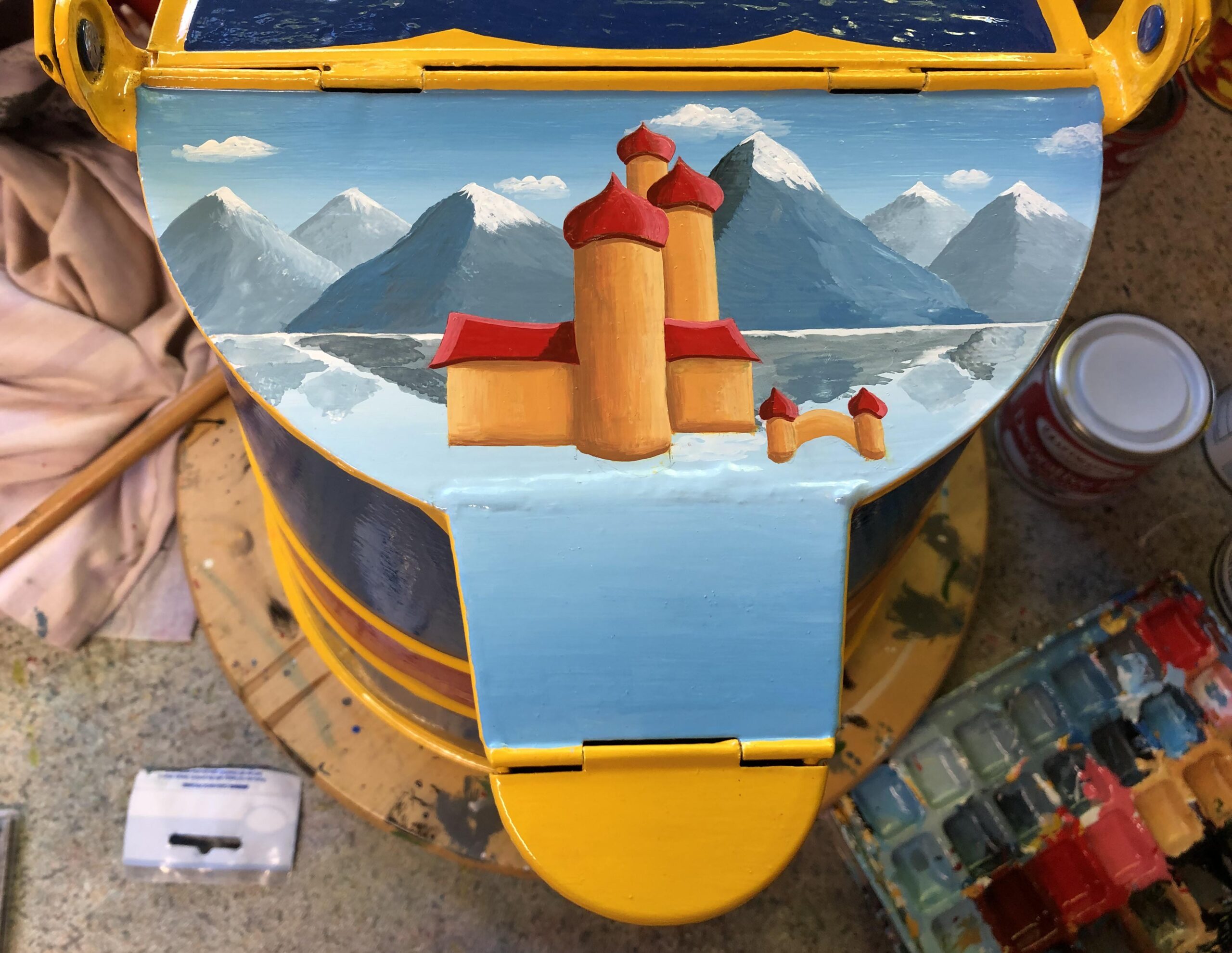
The foreground is now blocked in with greens and shading, highlights added. Darker green used used closer to the castle where there would be shade from one to the other.The foreground is also darker to help bring it forward.
STAGE 16
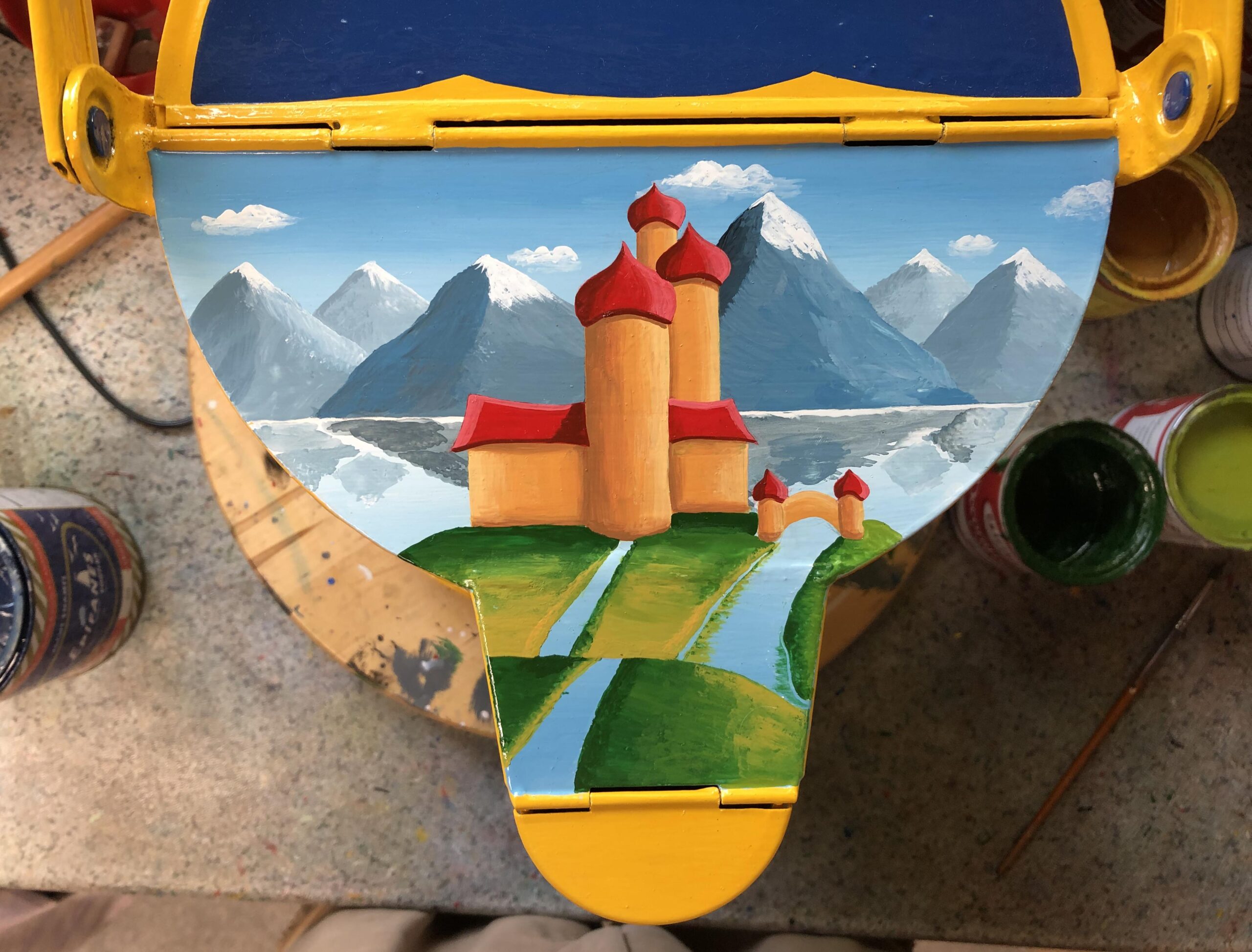
Then add the path using a sandy colour with shading a highlights. Always think of the direction the light is coming from. Use the darker colour for the underside of the bridge and its reflection.
STAGE 17
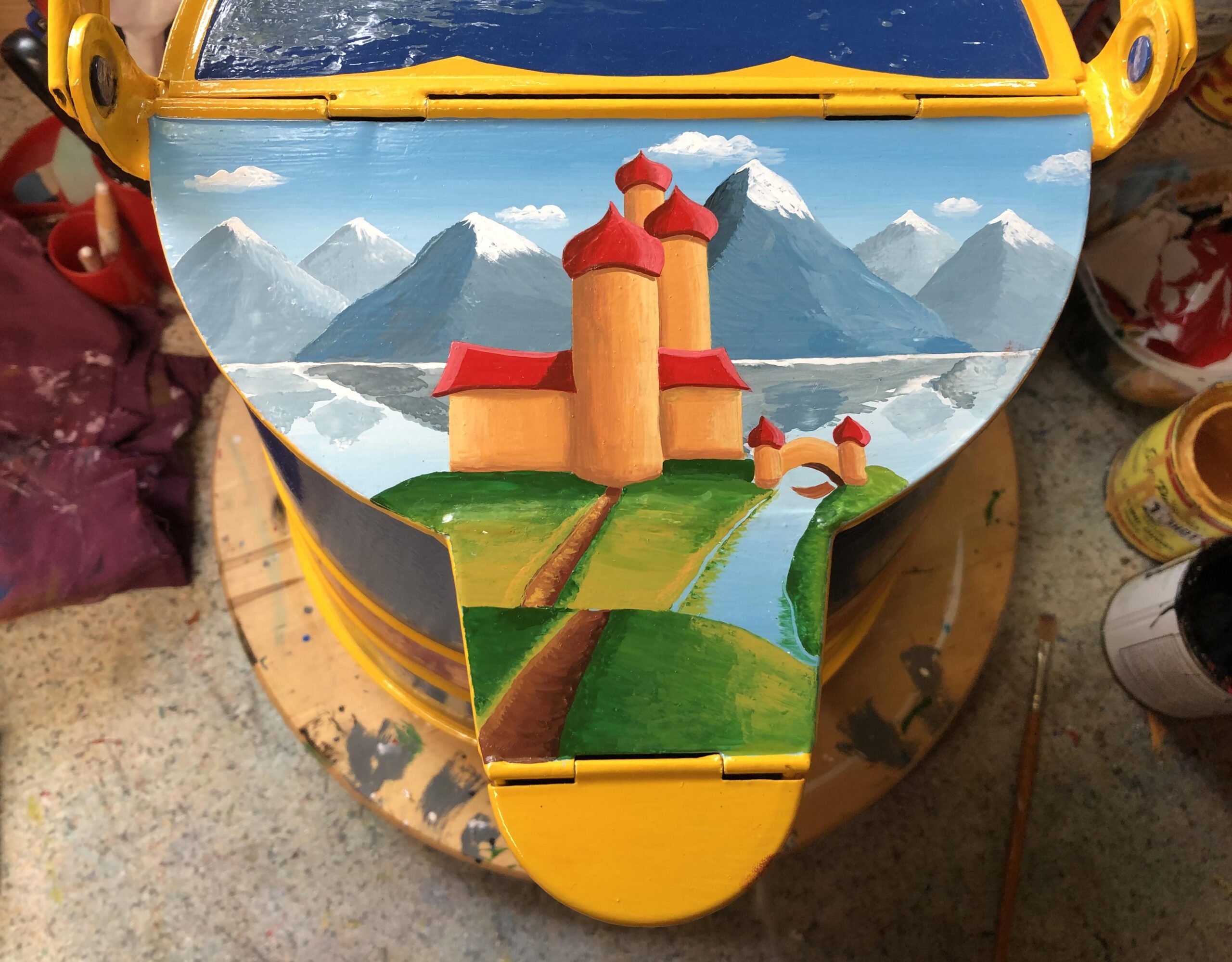
In this example details in black are added to the castle plus painting of the boats and birds. Black has also used to darken the shaded side of the castle and bridge. Traditionally there were no birds or black lines around the edges of the castle or bridge.
STAGE 18
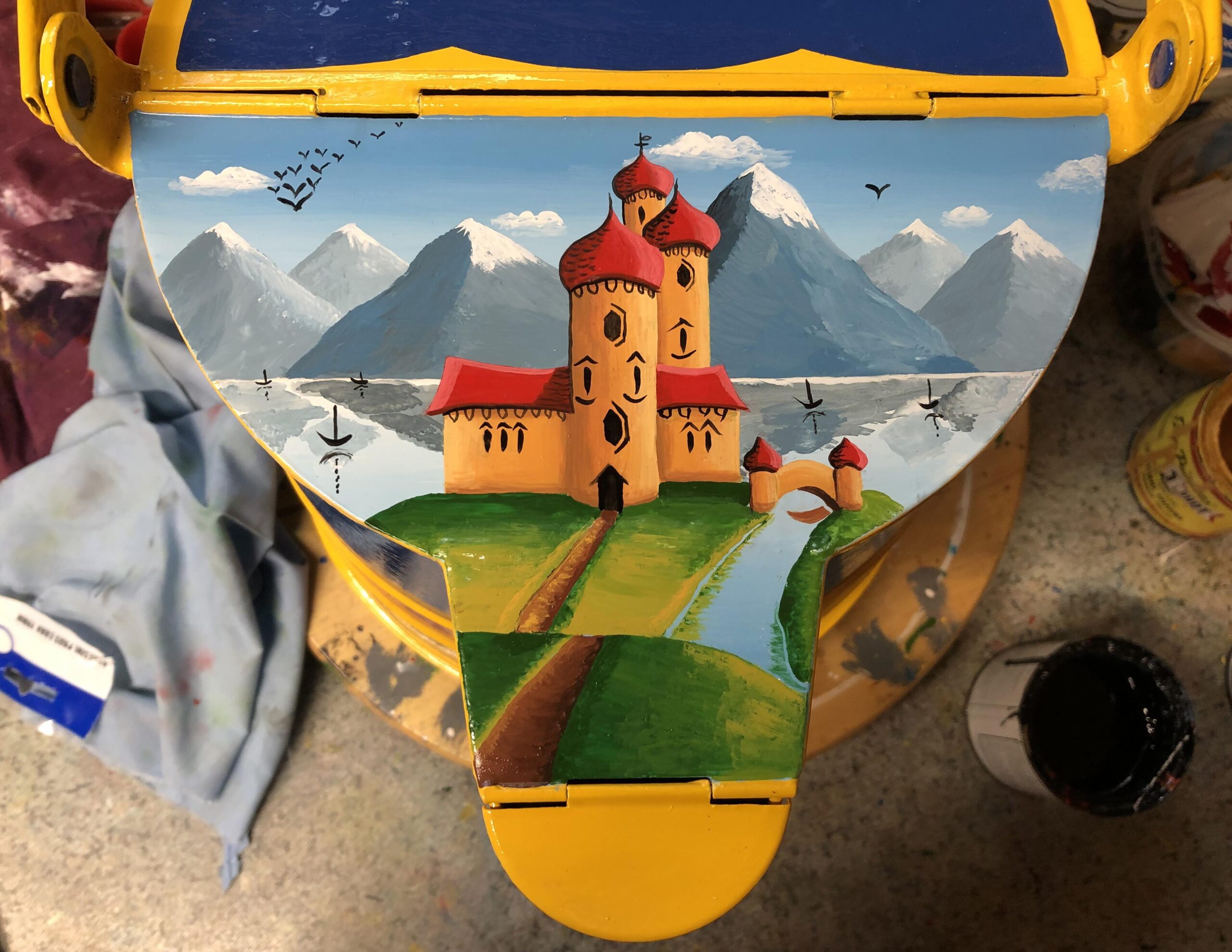
In this example details in black are added to the castle plus painting of the boats and birds. Black has also used to darken the shaded side of the castle and bridge. Traditionally there were no birds or black lines around the edges of the castle or bridge.
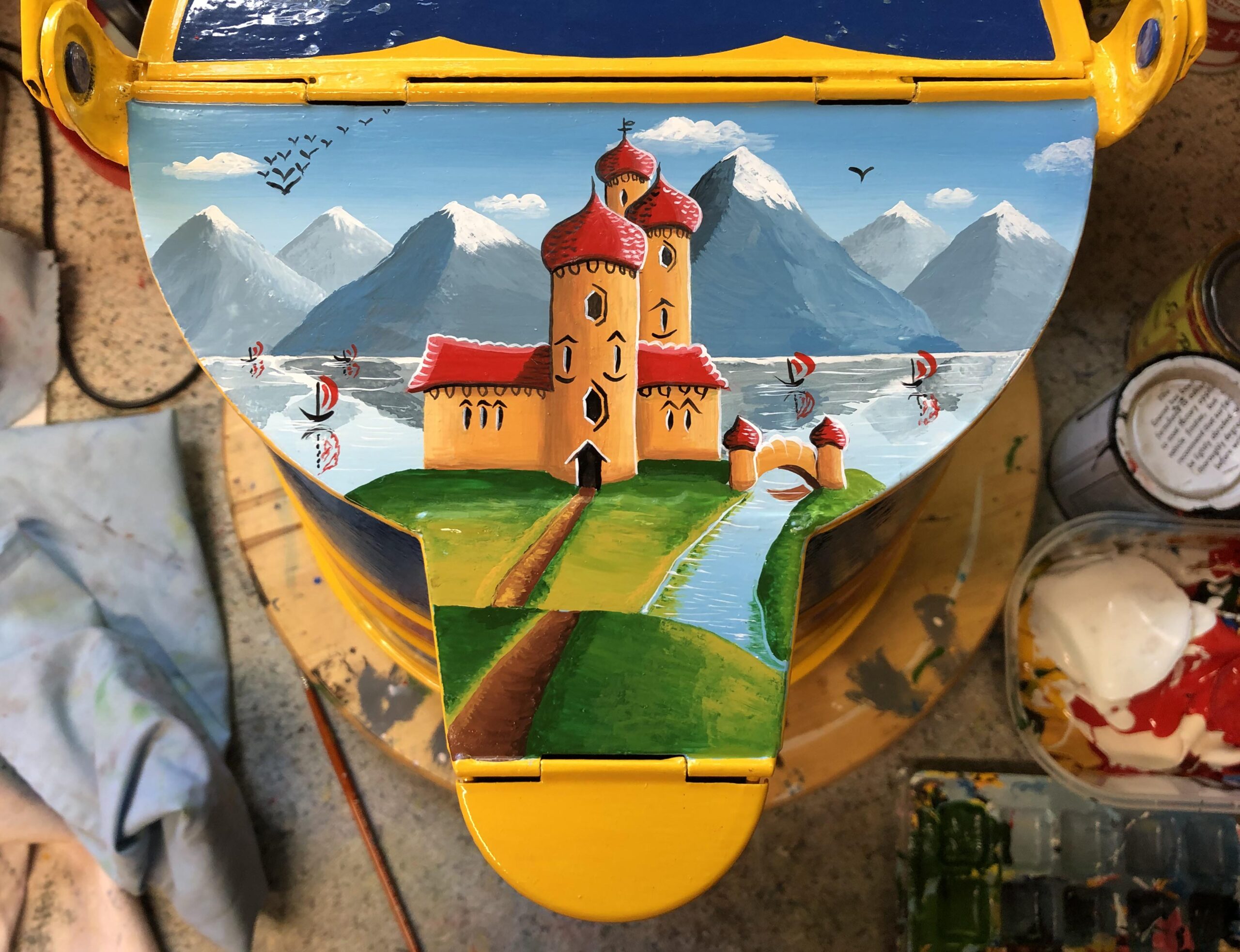
STAGE 19
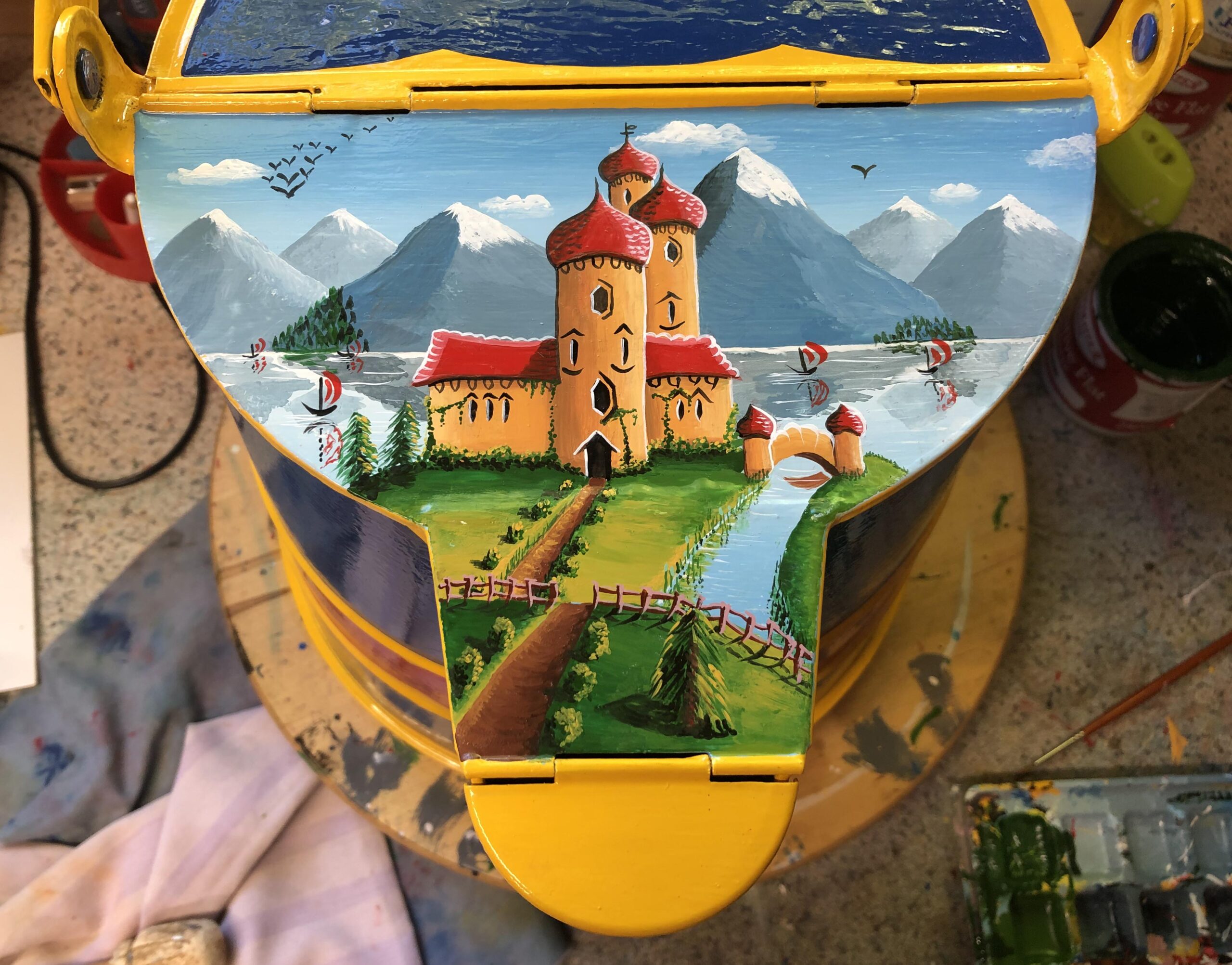
In the final stage of the castle picture all the smaller detail have been added. This includes bushes and trees with highlights and shadows. Red sales have also been added to the boats. In this picture a fence has been included to help with the perspective of the picture.
FLOWERS
Panels on traditional water cans often revolve around three large roses fitted into each space. I see a number of reasons for this: There were fewer flowers to paint so making the process quicker. Three roses fitted together so there was less of gap between them. Roses ended up as three main colours, of red, yellow and white although sometimes there was a pink rose. Blue was very rarely used as it faded badly. It wasn’t really until about the 1980’s that blue pigments were developed that would be colourfast in sunlight over a long period. Who remembers when BWB rebranded itself in the 1970’s with blue & white signs. The blue on those seemed to fad quite quickly. My final reason for the fewer number of flowers was that water cans were generally be viewed from a distance so the designs had to be big and bold enough to stand out from a distance.
STAGE 20
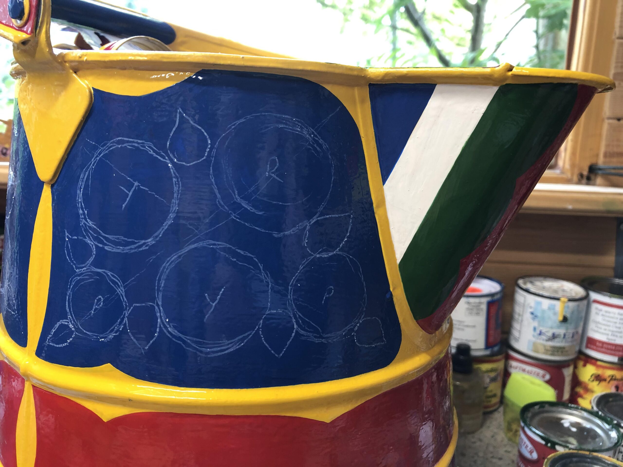
I know that some people can paint the flower patterns straight onto the surface but I like to draw an outline first to help position the flowers. This helps keep the flowers in the panels without getting too close to the edges. It's like they say in photography, you need a degree of ‘separation’ around your main subject to help it stand out. I have seen a number of examples were the flower decoration has gone right to the edge of the panel. The decoration in itself may be every good but it will stand out better if it has space around it.
STAGE 21
I like to paint the leaves first so the flowers can sit on top. Some people will paint the base colour and shading of the roses first but I mostly complete the leaves first. In this example I have painted the background colour of the leaves in two halves. To get over the problem of too much space between some of the flowers I have filled in the space with a dark green to help distract the eye from the background colour of the can.
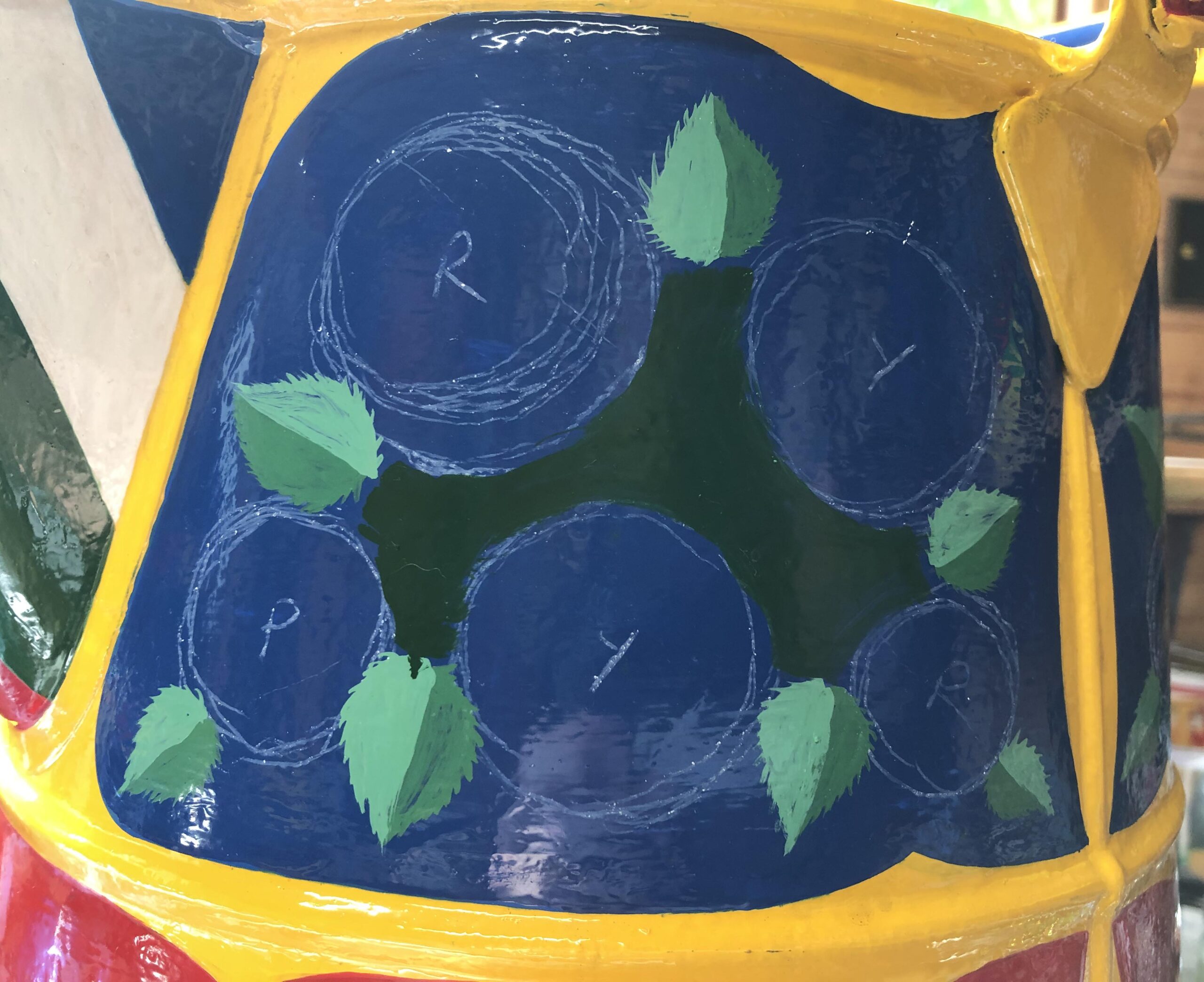
STAGE 22
After painting the background colours the lighter half of the leaves have a highlight added and the darker side, shading. From a traditional point of view this is getting too complicated. It would have taken too long for all these additional refinements. At t his stage things are looking a bit rough as you are close up to the detail. If you got up close to an 'impressionist' painting, that would look rough.
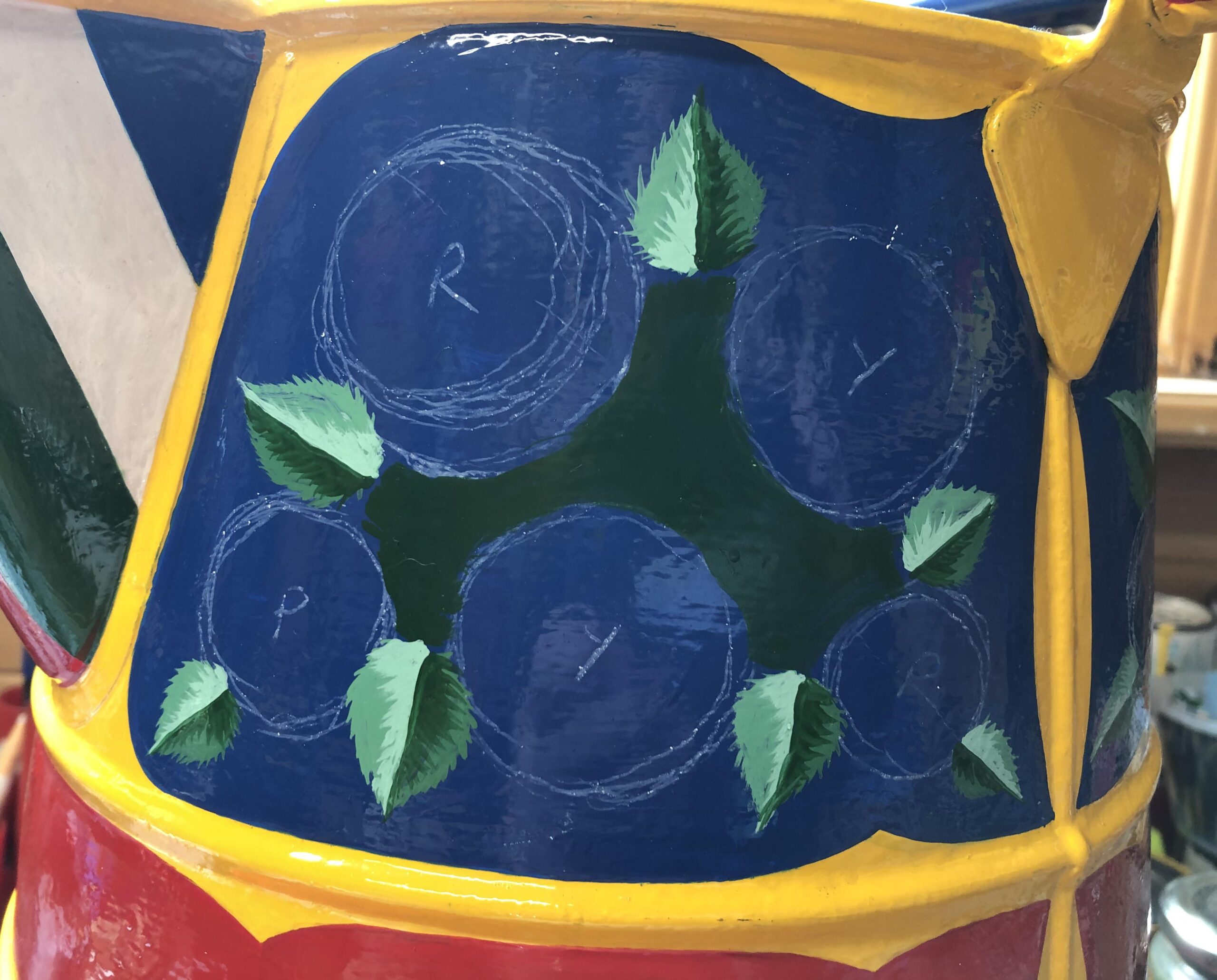
STAGE 23
The final stage of painting these leaves is to add the veins. This leaf is my own design and I wanted it to have an edge that was more like a real rose leaf although it took longer to paint.
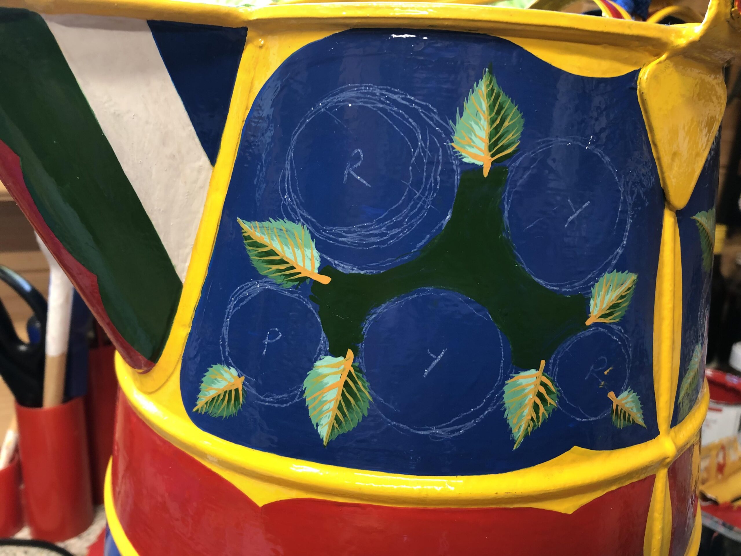
STAGE 24
This picture shows the first stage in painting the Roses. My usual colours end up as red, yellow and white but in this variation they will be slightly orange, a deep pink and a purple.
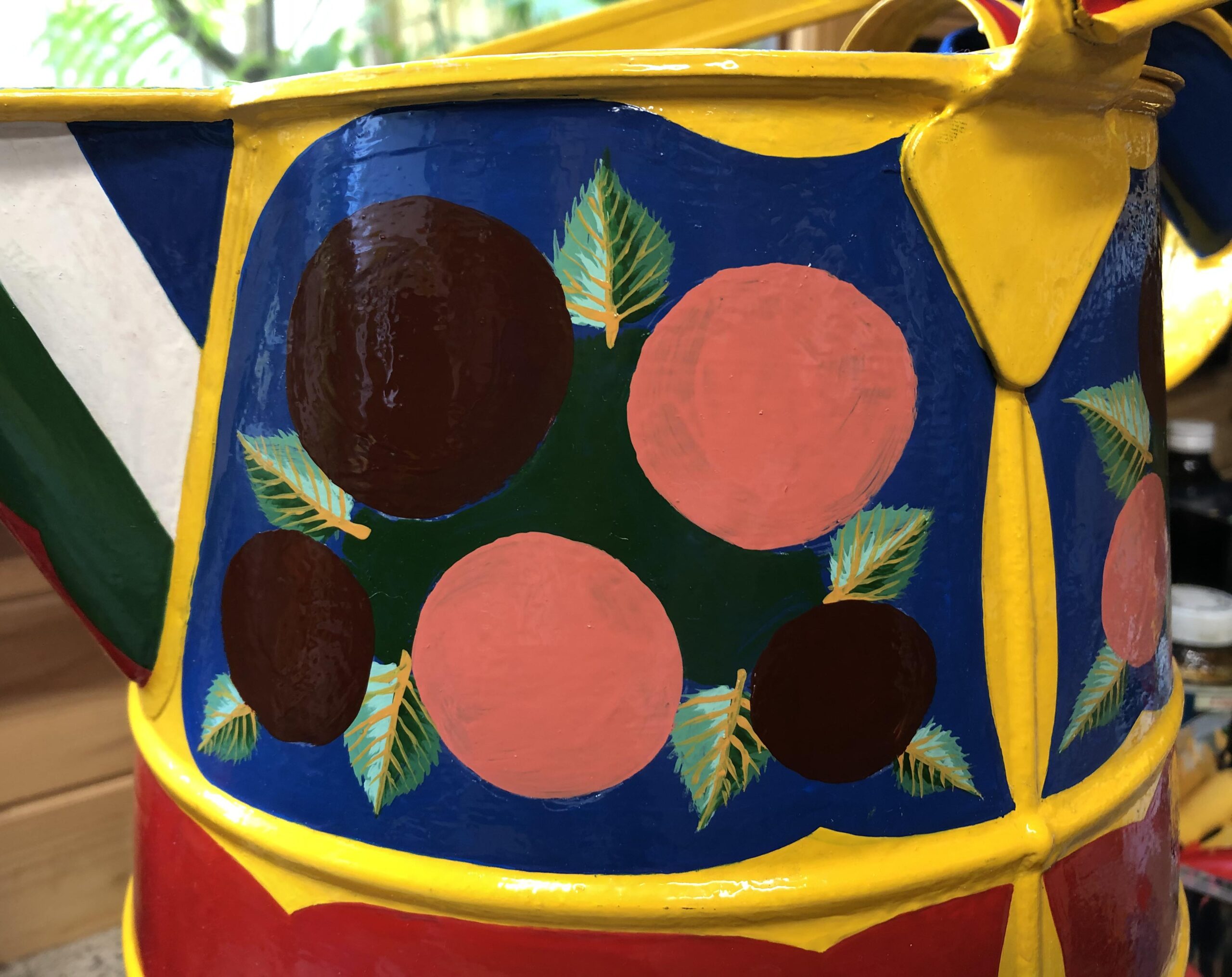
STAGE 25
I suppose it could be said that the idea for this design is based on the 'Knobstick' rose. This picture shows the shading on the background colours. The slighly orange and purple flowers have the same backgroud colour.
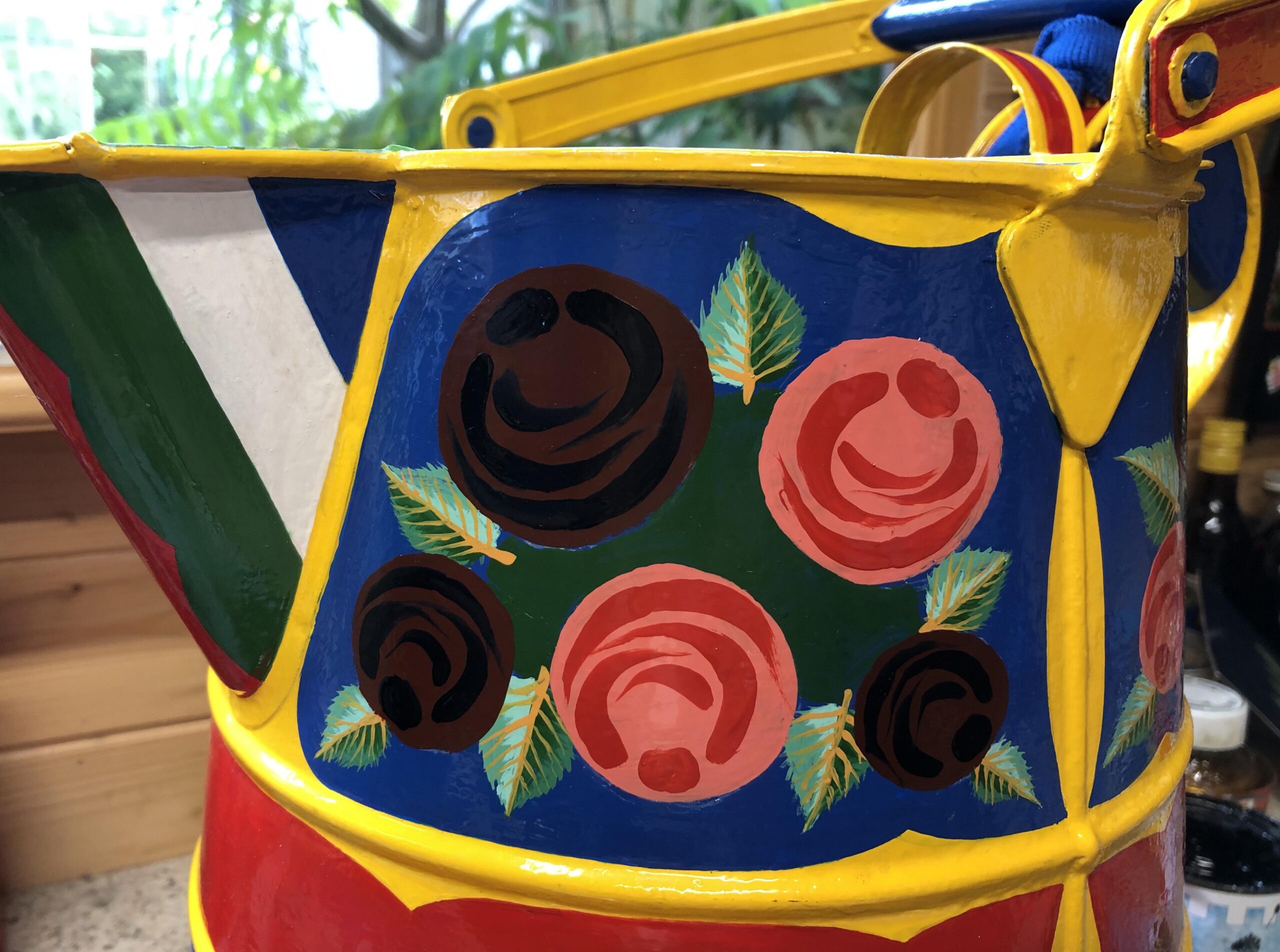
STAGE 26
Many paint colours used to have lead added for a number of reasons but one was to give it a bit more body. It is now known that lead can lead to brain damage so it has been removed from many products including paint. This means that some colours like yellow can seem a little thin. By adding a little read to the yellow and creating a slightly orange colour, I have found it seems to give the yellow a little more body.
STAGE 27
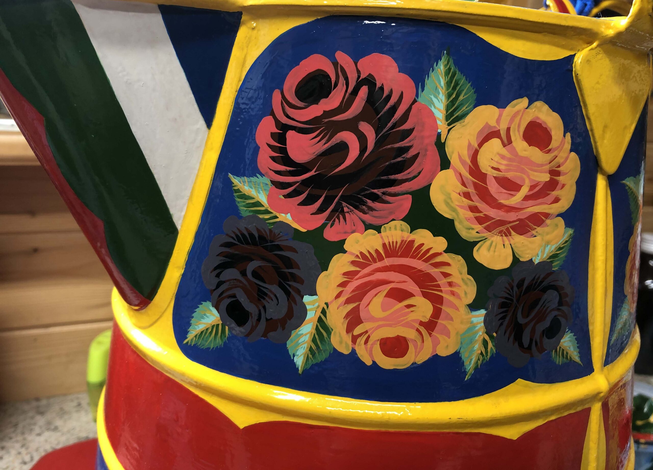
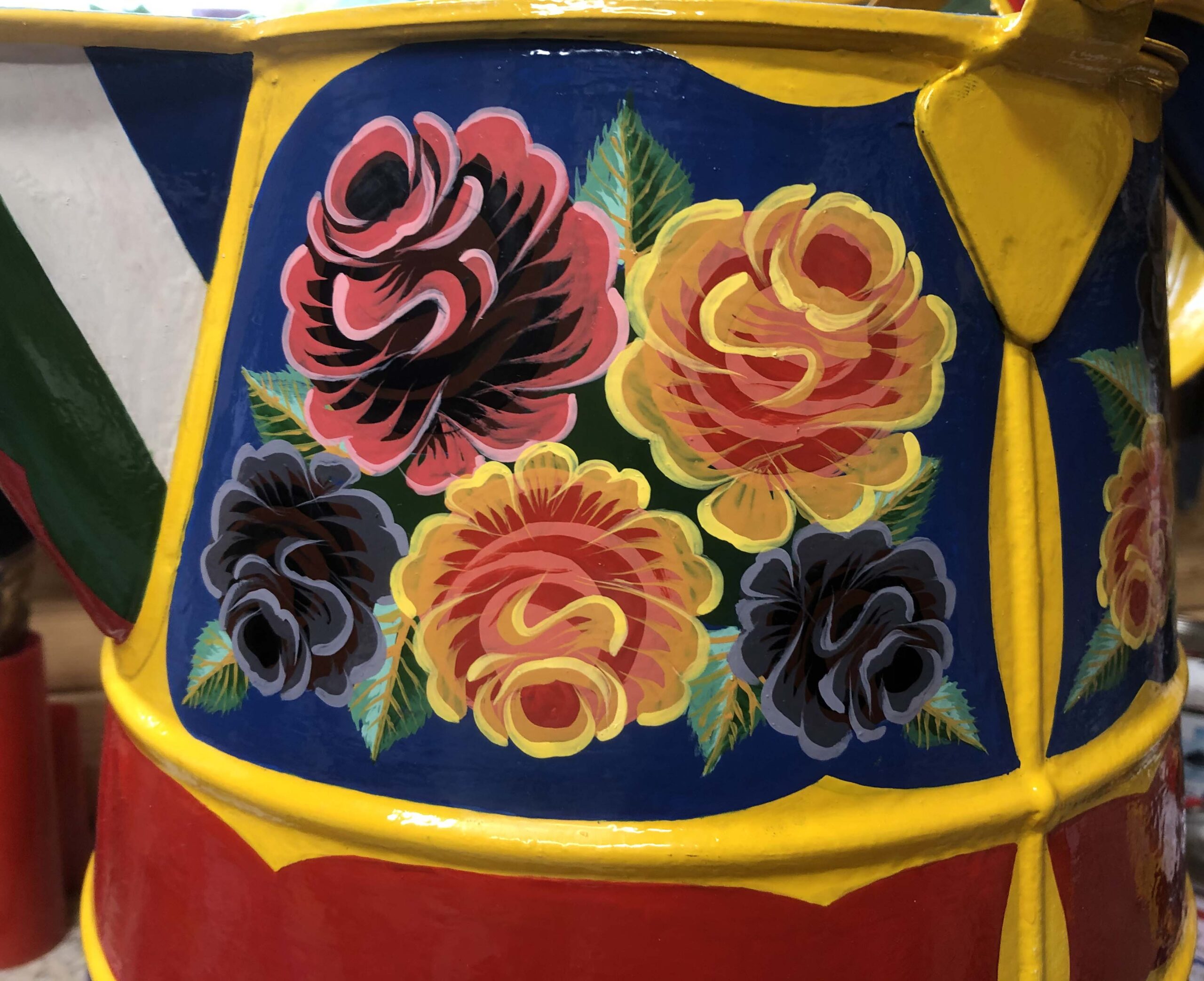
A lighter version of each colour is added to the edges of the petals for highlights and this really seems to help the roses stand out.
STAGE 28
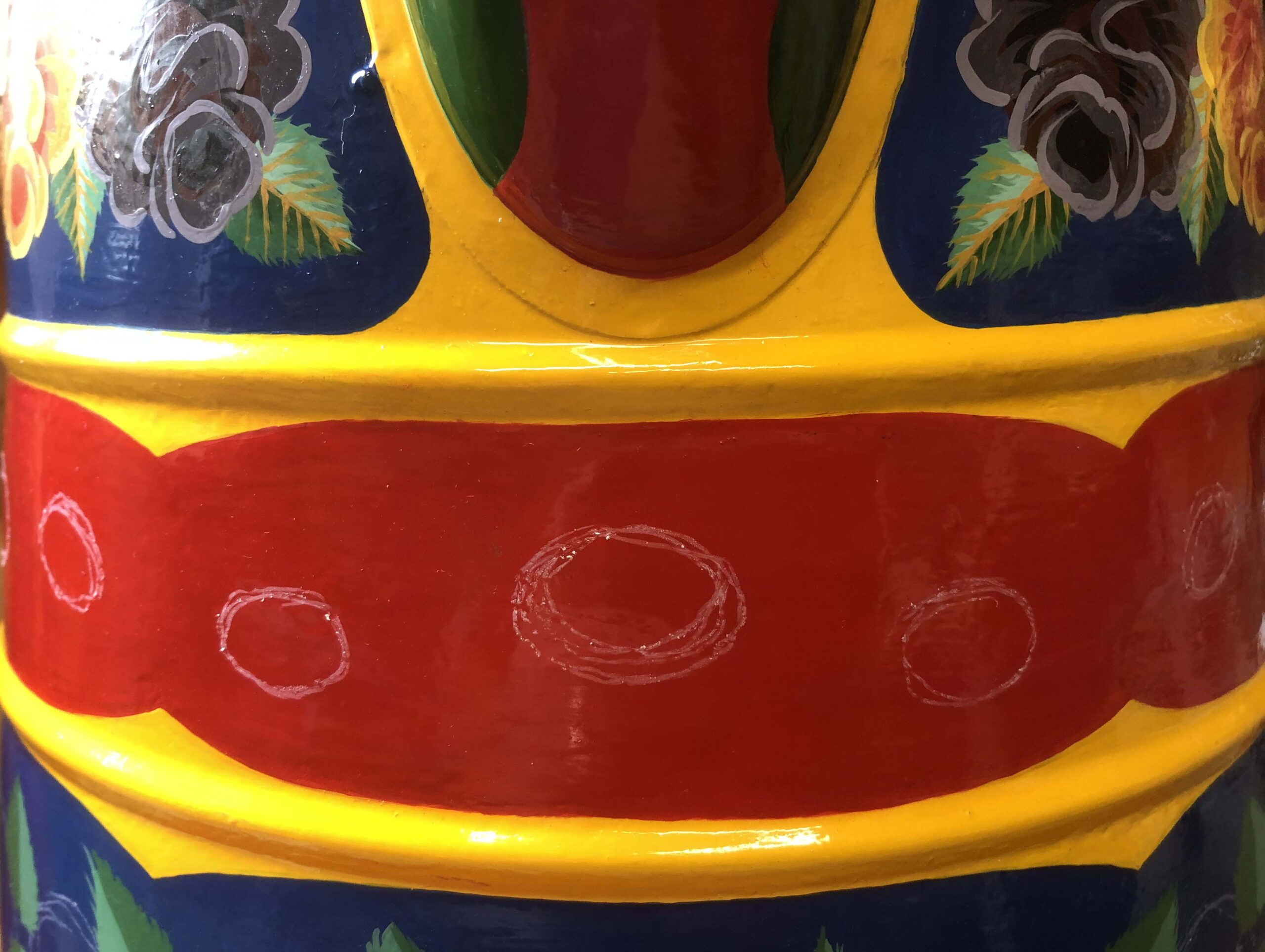
Traditionally Water Cans would often have the name of the boat sign written around the middle band but as this is not being painted for a specific boat I am adding a string of daisy like flowers to the band. First they are drawn out do they are positioned equally. Some will be full daises and some half.
STAGE 29
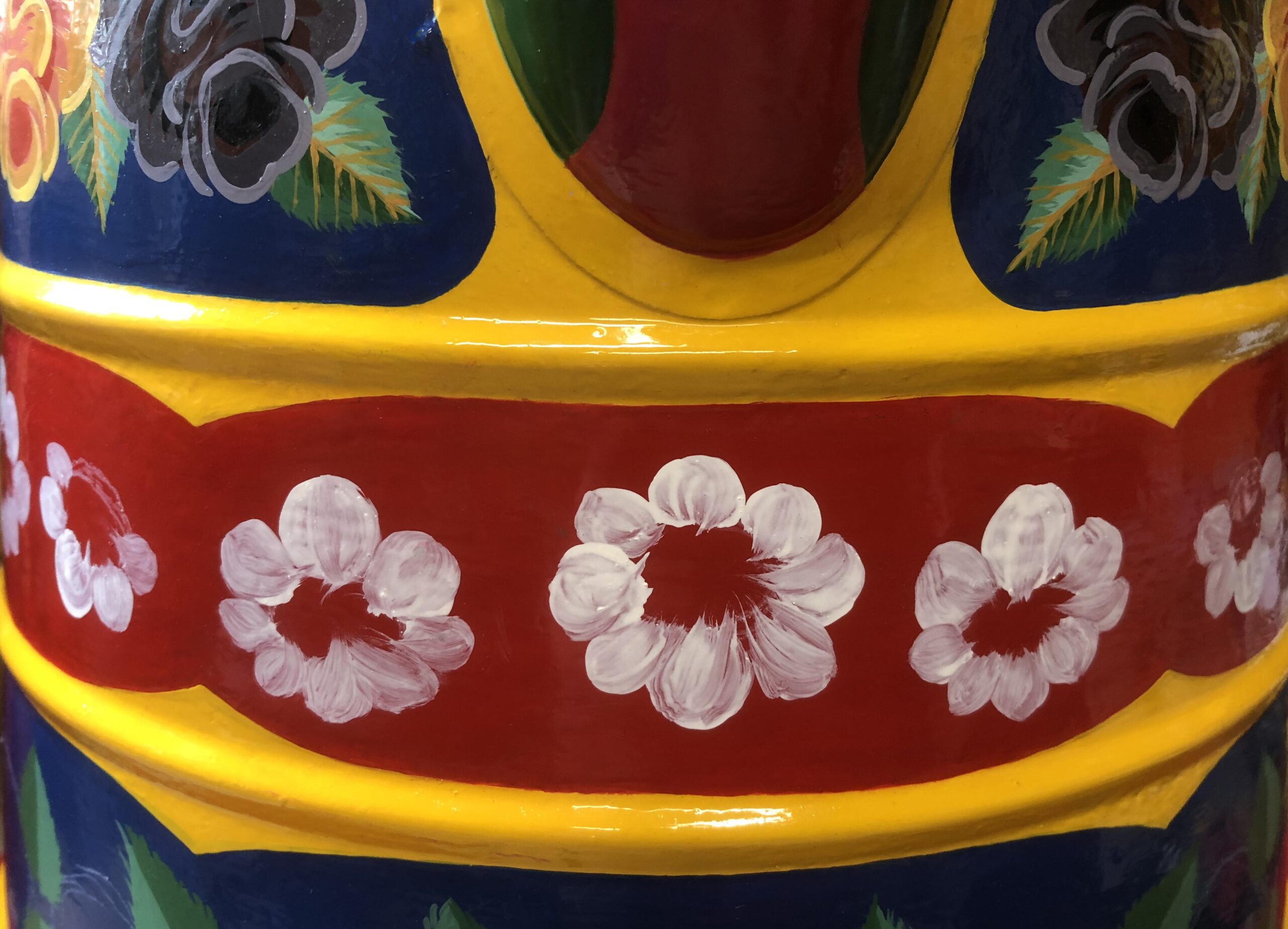
All the petals are painted in white with the paint added sparingly. This is so the background colour can show through and help create a translucent effect.
STAGE 30
A second layer of white is added to create a 'highlight' if you can have a white highlight on white! But it did seem to work.
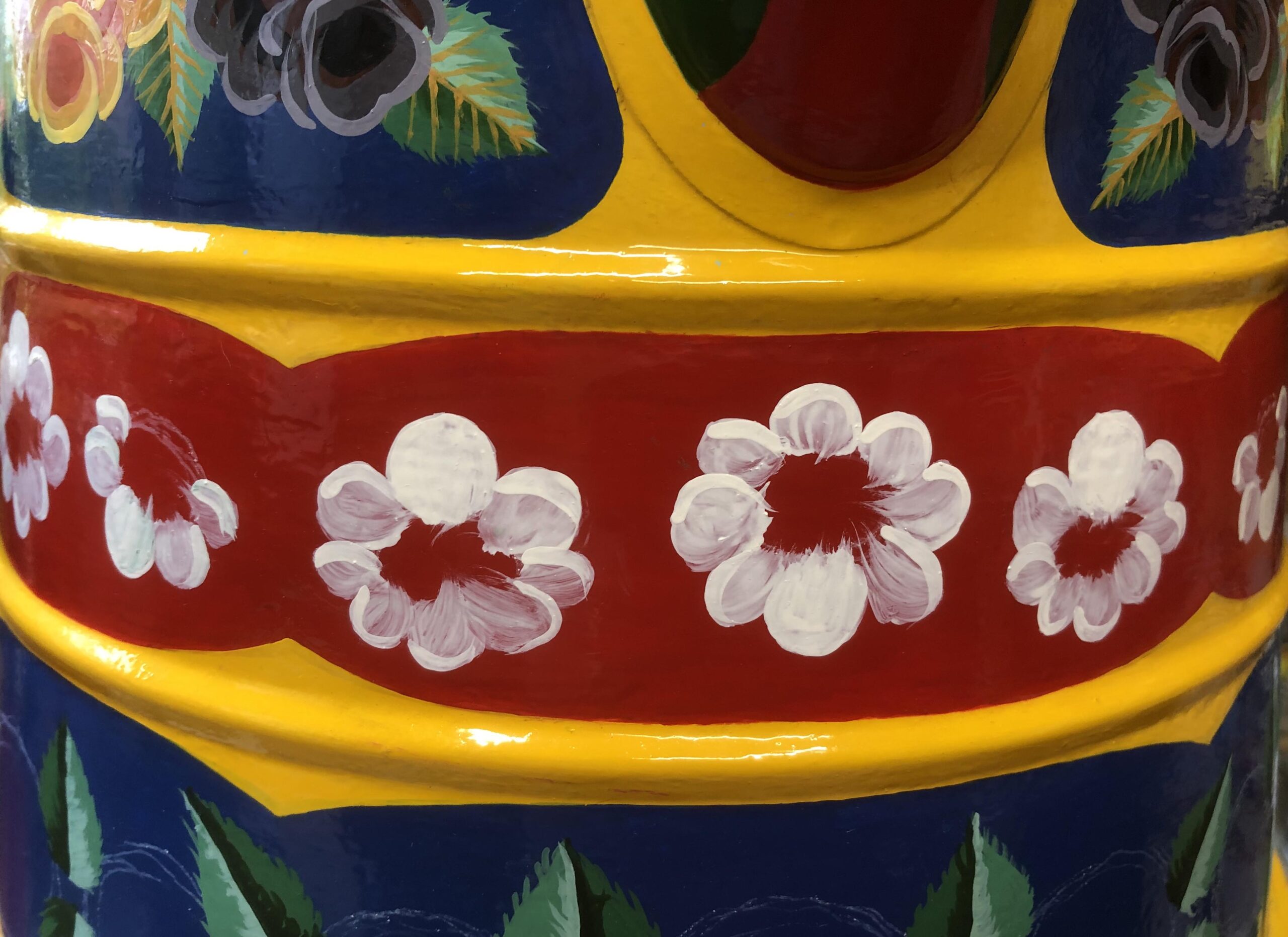
STAGE 31
The centre of the daises are then filled in was a brown colour.
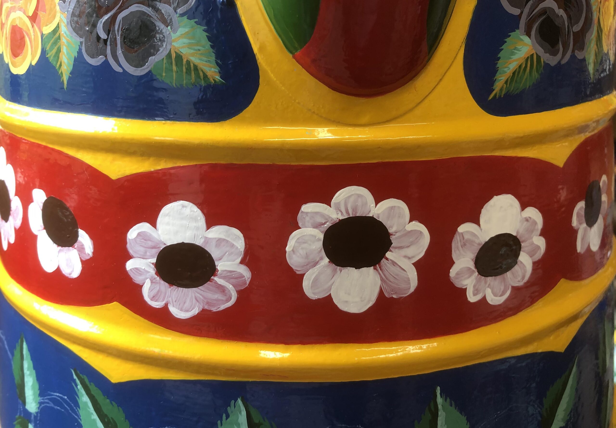
STAGE 32
The centre of the daises it finished with a pink around the edges and yellow dots for pollen on the up half to create a rounded effect..
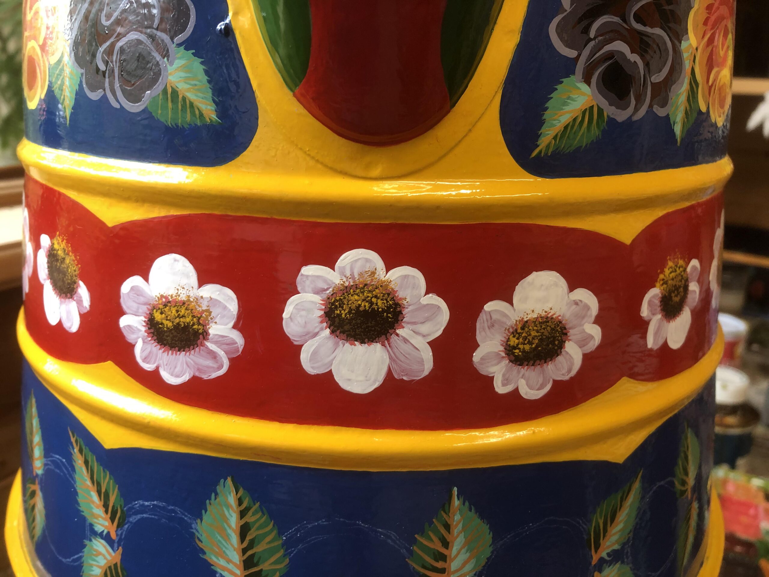
STAGE 33
Gaps between the daises are filled in with leaves painted in single strokes.
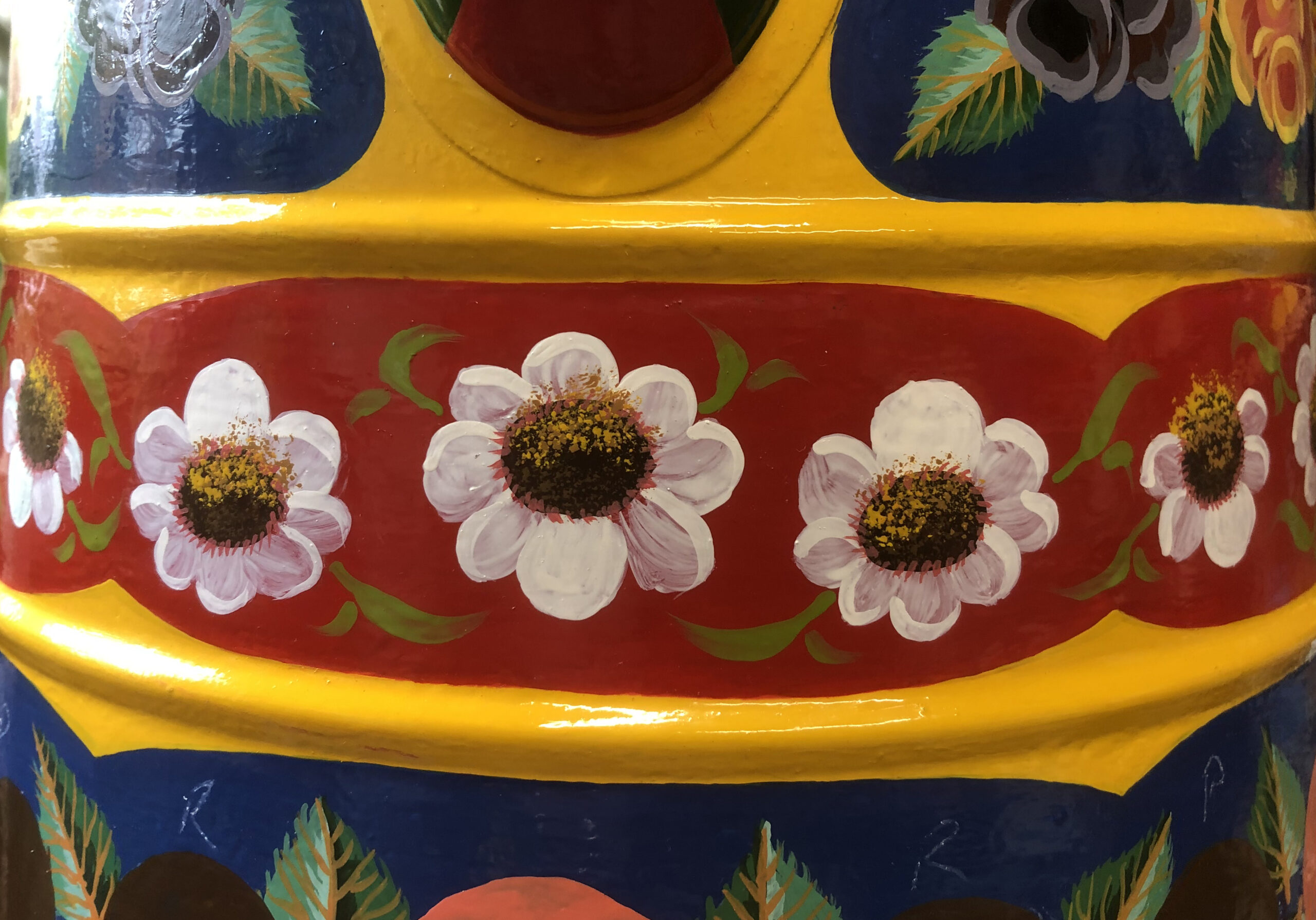
STAGE 34
The last three stages are flicks in yellow. These have been added to the spiot. There seems to be no real pattern as to how this part of the water can is paint so it seems to vary from painter to painter.
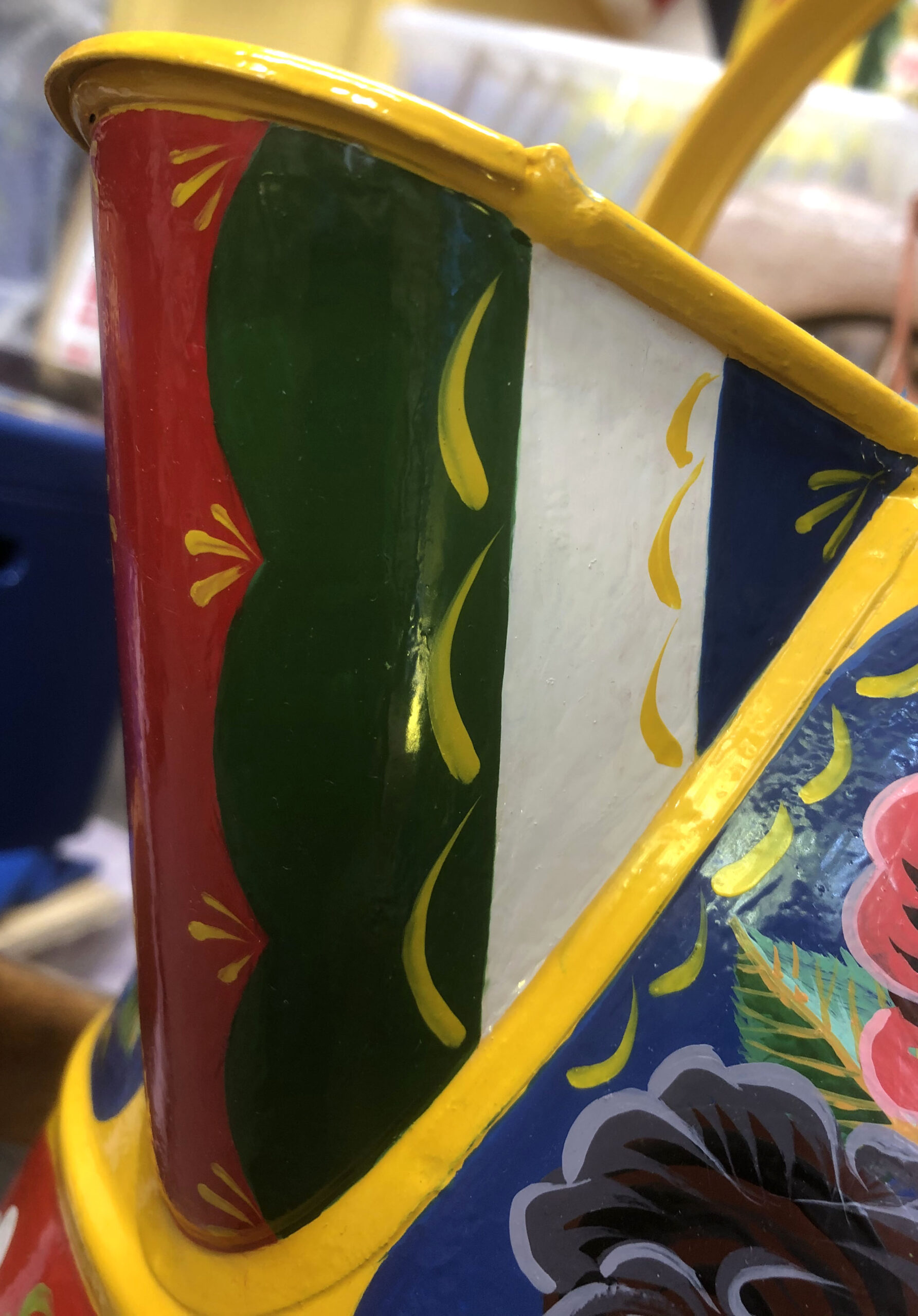
STAGE 35
Yellow flicks added around the bottom of the water can.
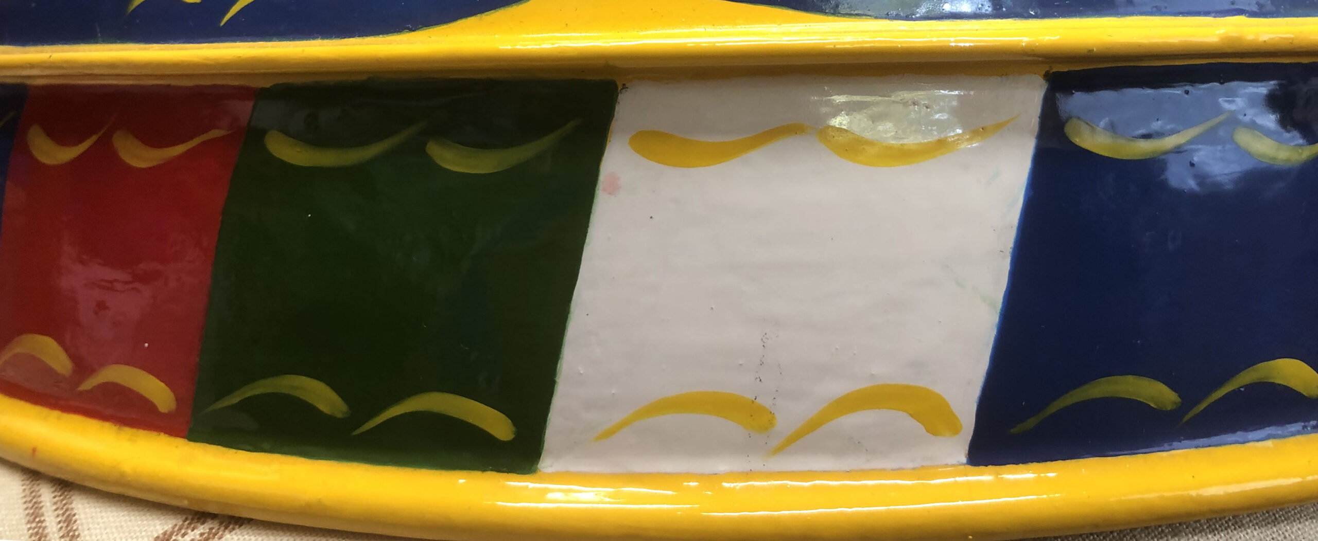
STAGE 36
Yellow stamens added to the roses. Sometimes I leave them off with this rose.
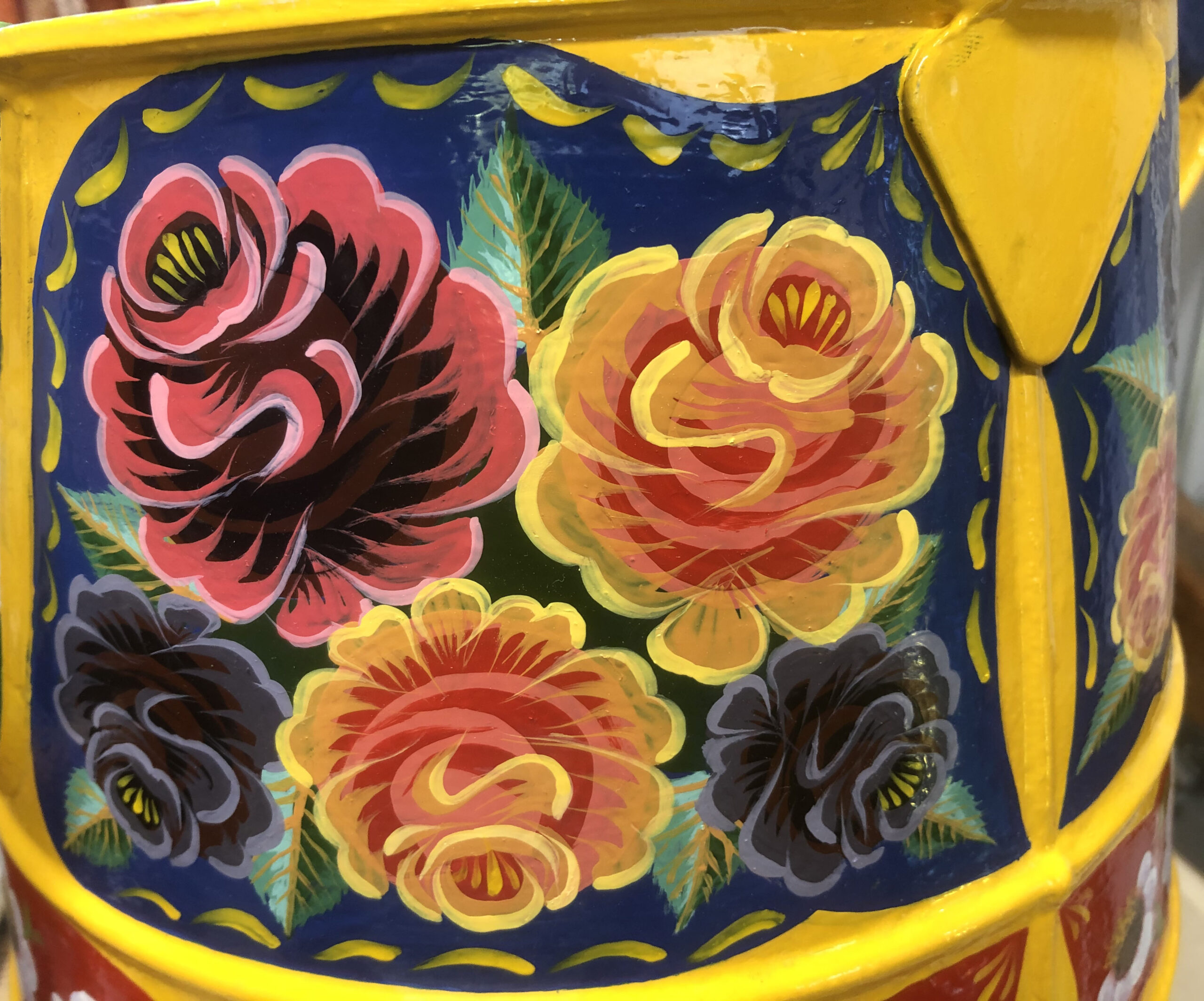
STAGE 37
When people see a new water can they often lift up the lid to look inside. There seem to be more and more people painting the inside of the lid. There is not really much point to this but I have done it on this example. I have even see people paint the bottom of the water can but the edges of are going to wear quickly.
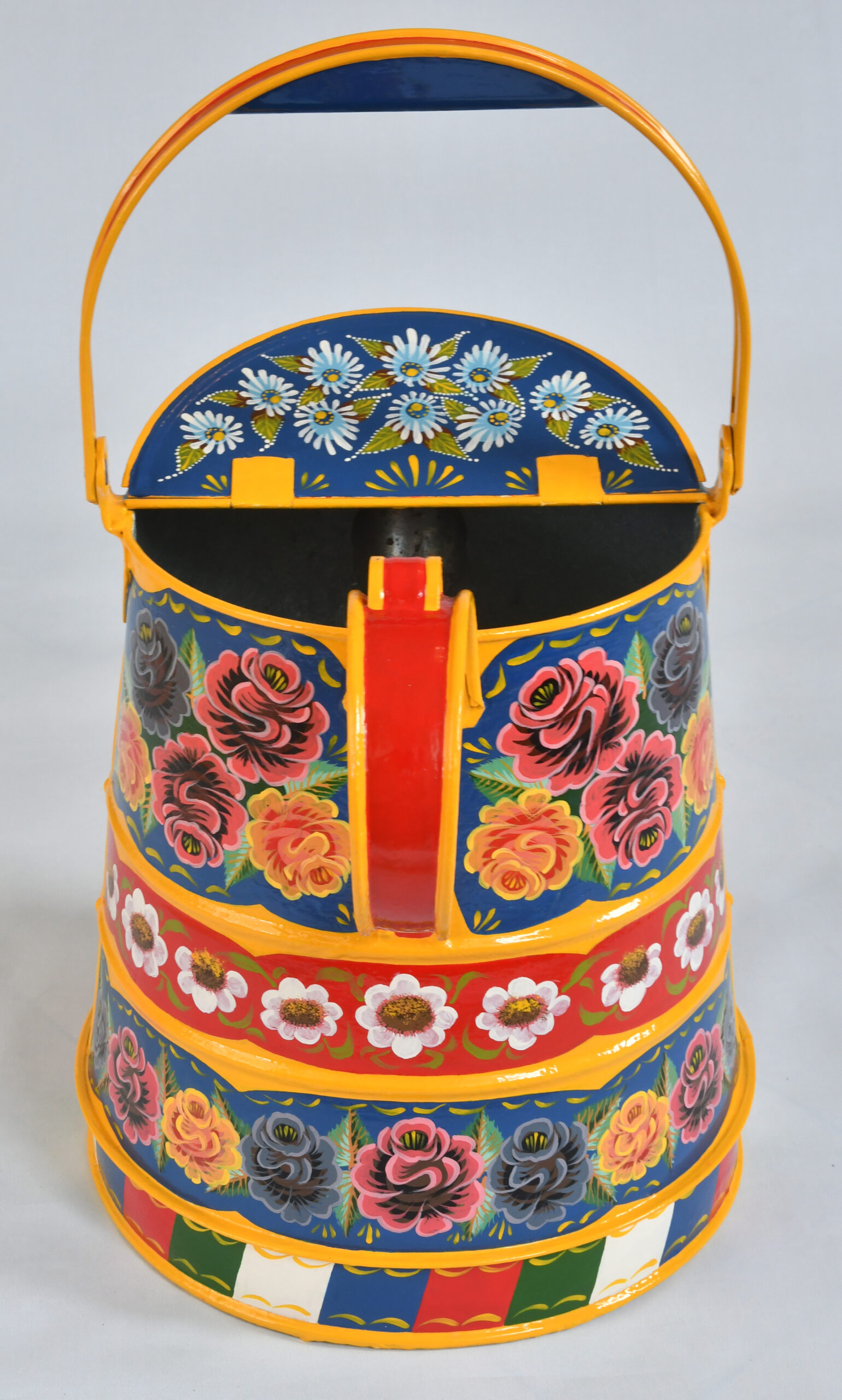
FINISHED
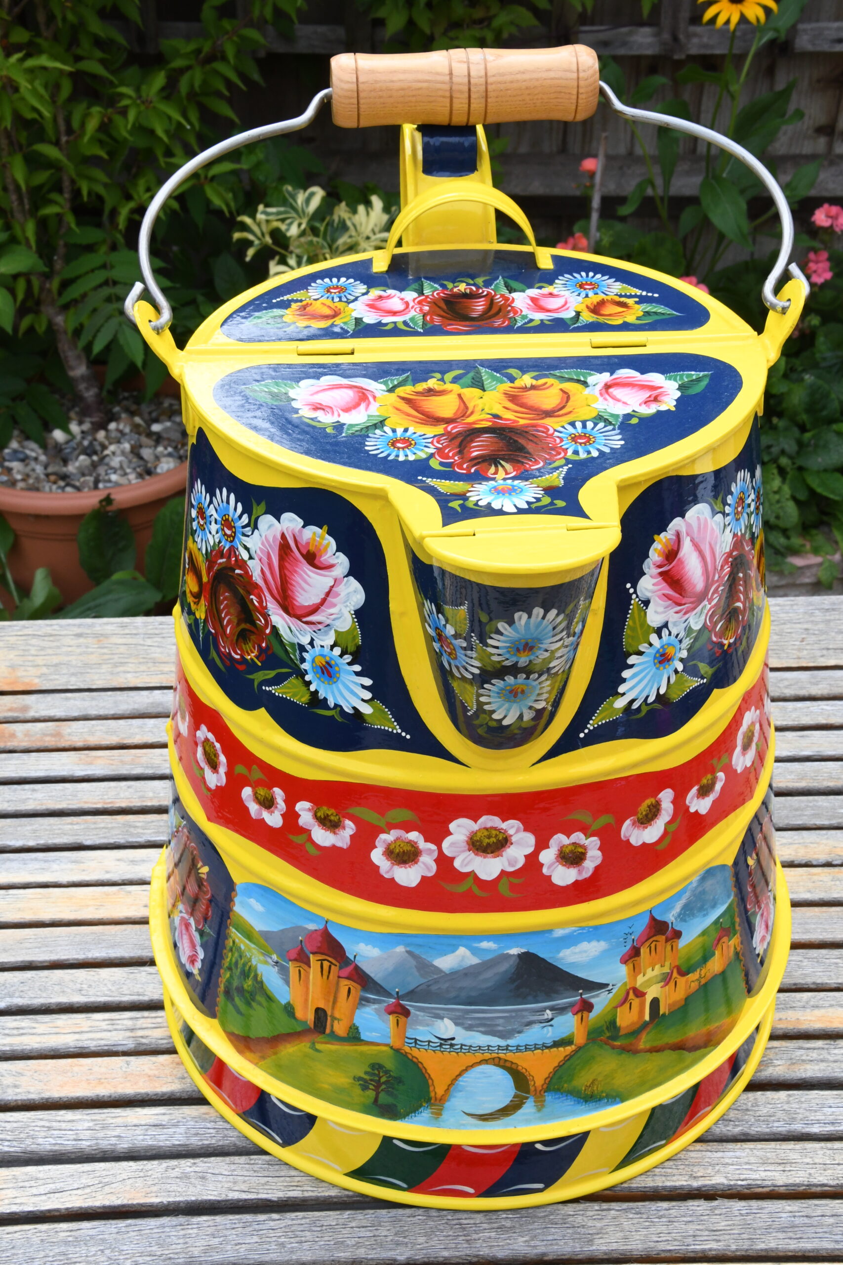
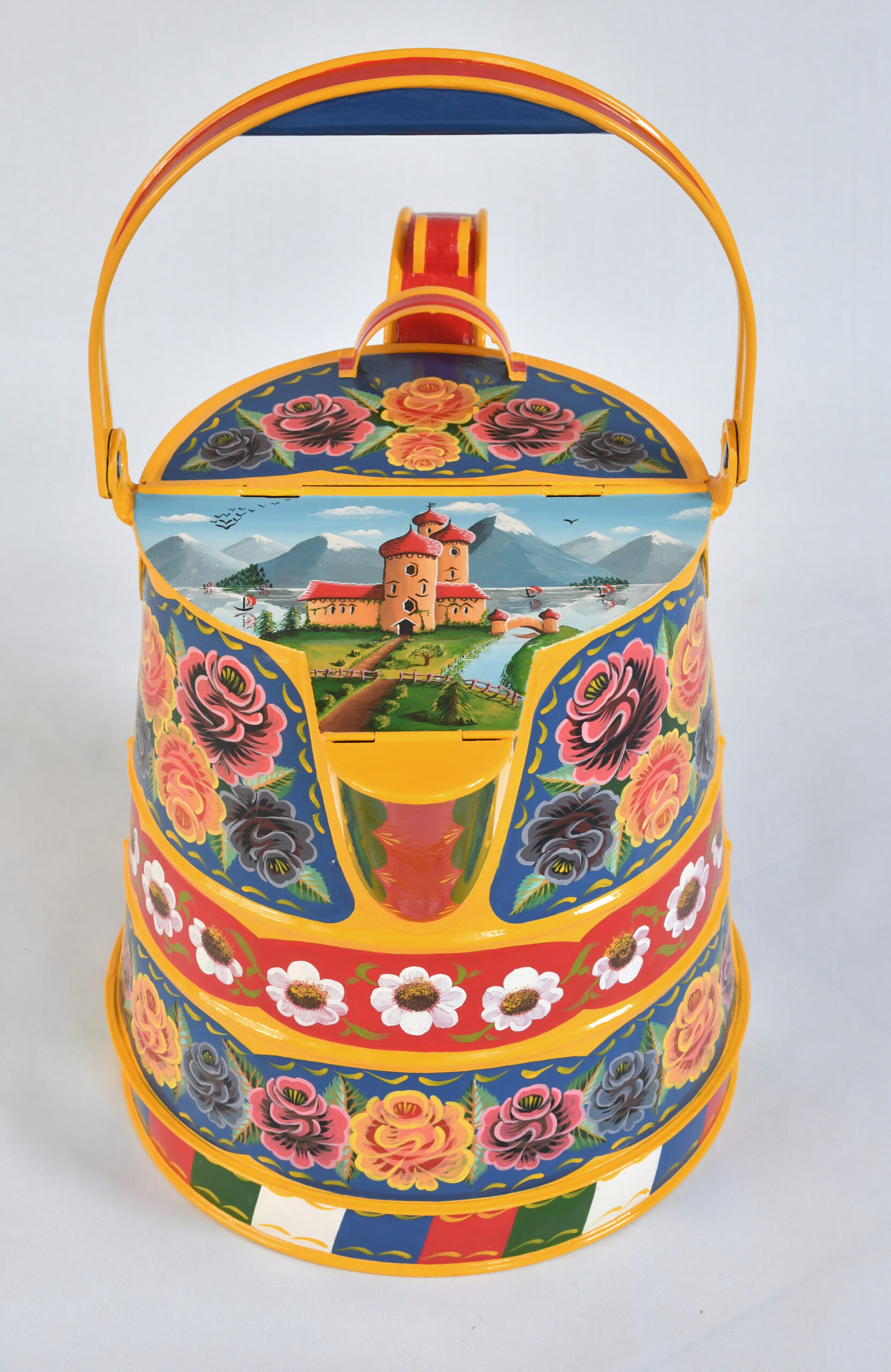
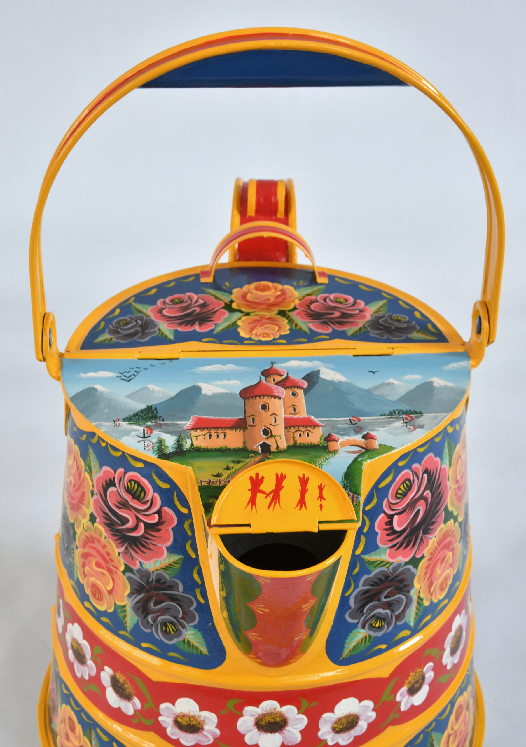
Finally the finished water can!
SPOUT VARIATIONS
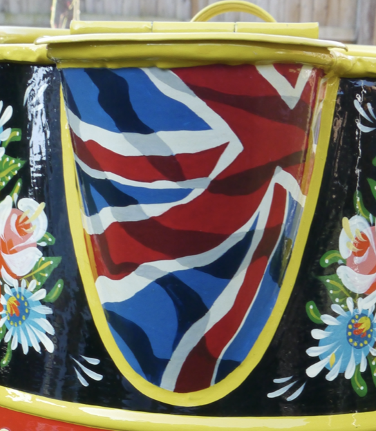
The spout shown in the centre was a representation of the Union Flag painted on a water can for the London 2012 Olympics.
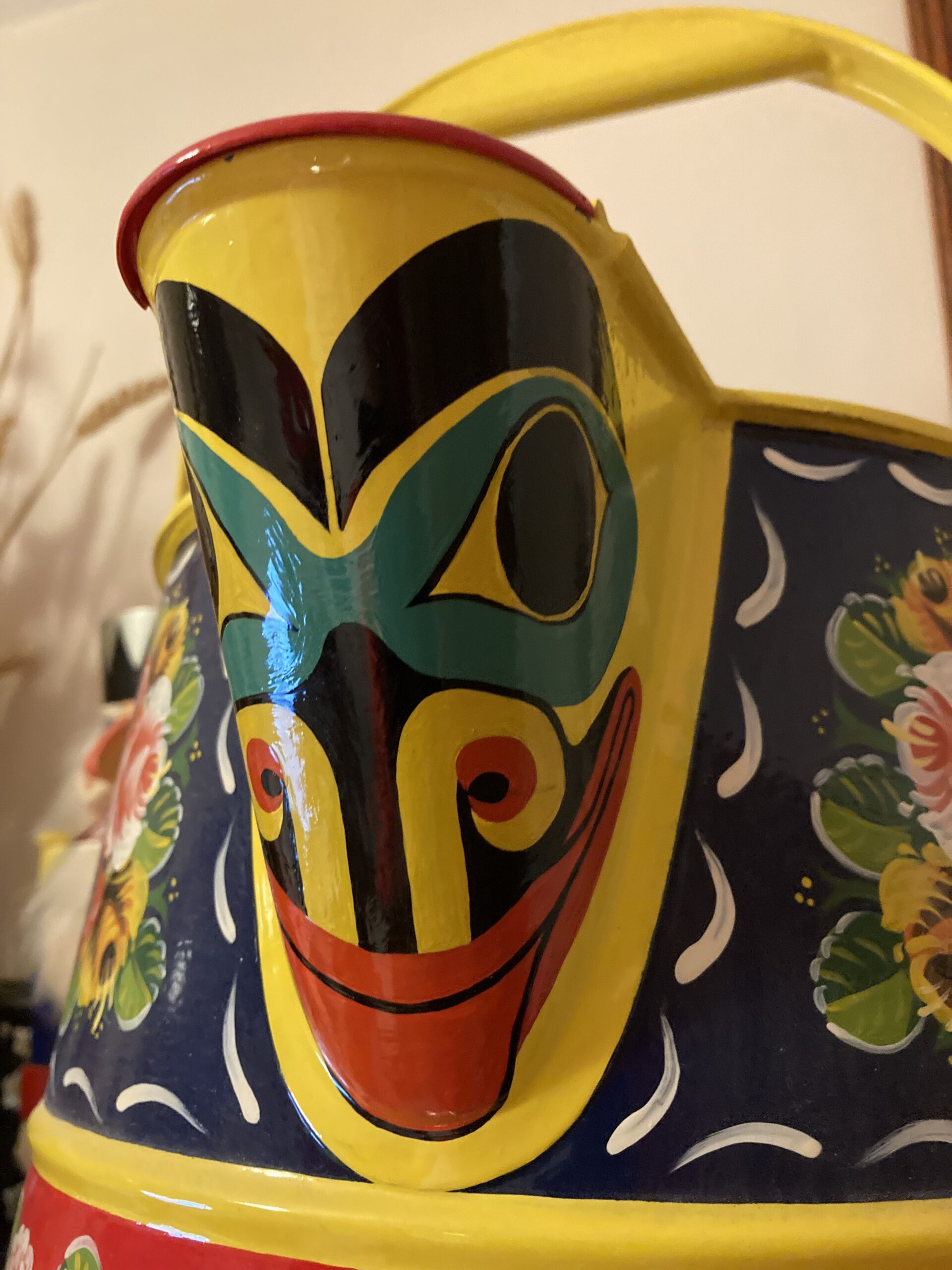
When visiting Canada a number of times I became rather taken with the Native Indian Art so added one of they're designs to the spout of one water can.
EXAMPLES OF MY PAINTED CANS
The picture in the centre shows the first water can I painted.
The picture on the right was painted for a boat called 'Essex Girl'. The castle picture was replaced with a view along the Chelmer & Blackwater Navigation to the old Gasworks at Chelmsford.
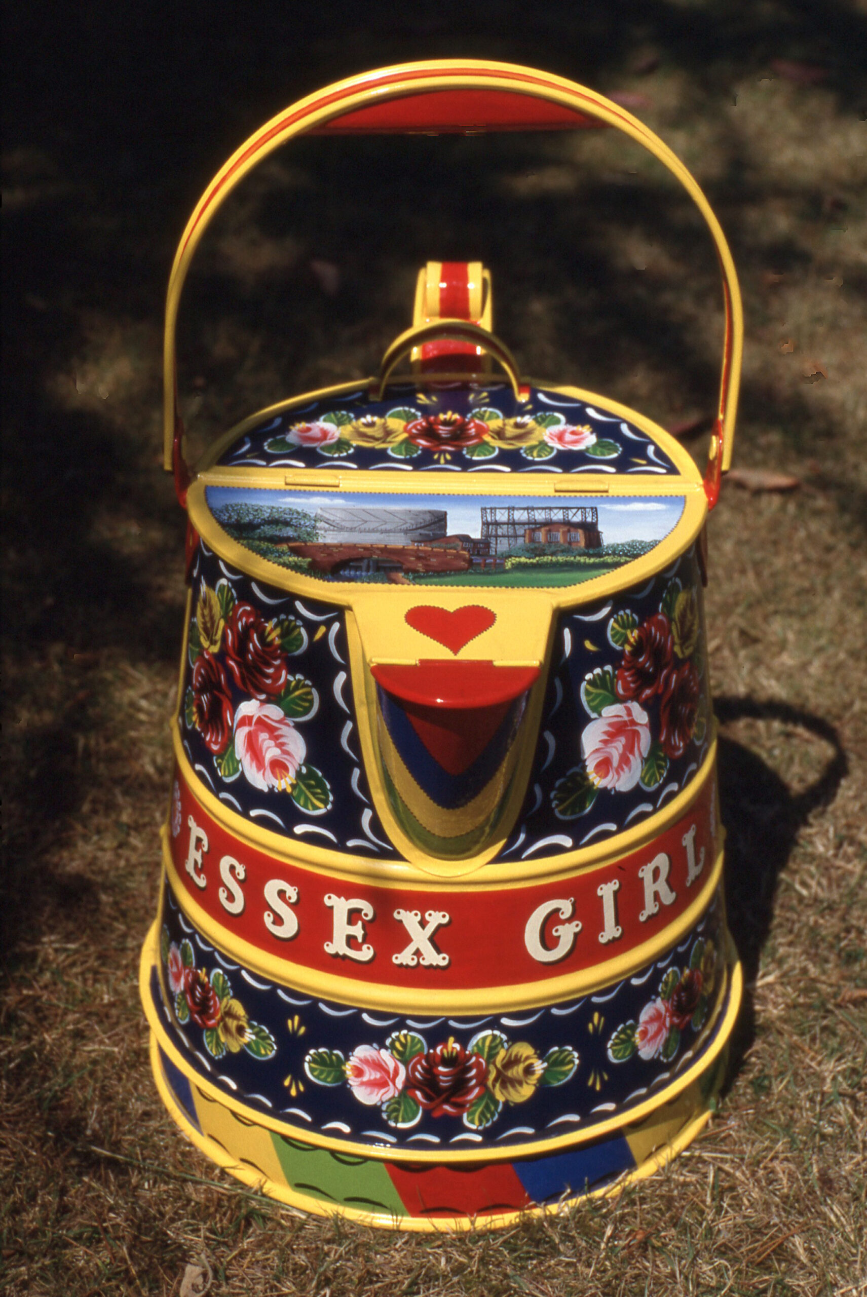
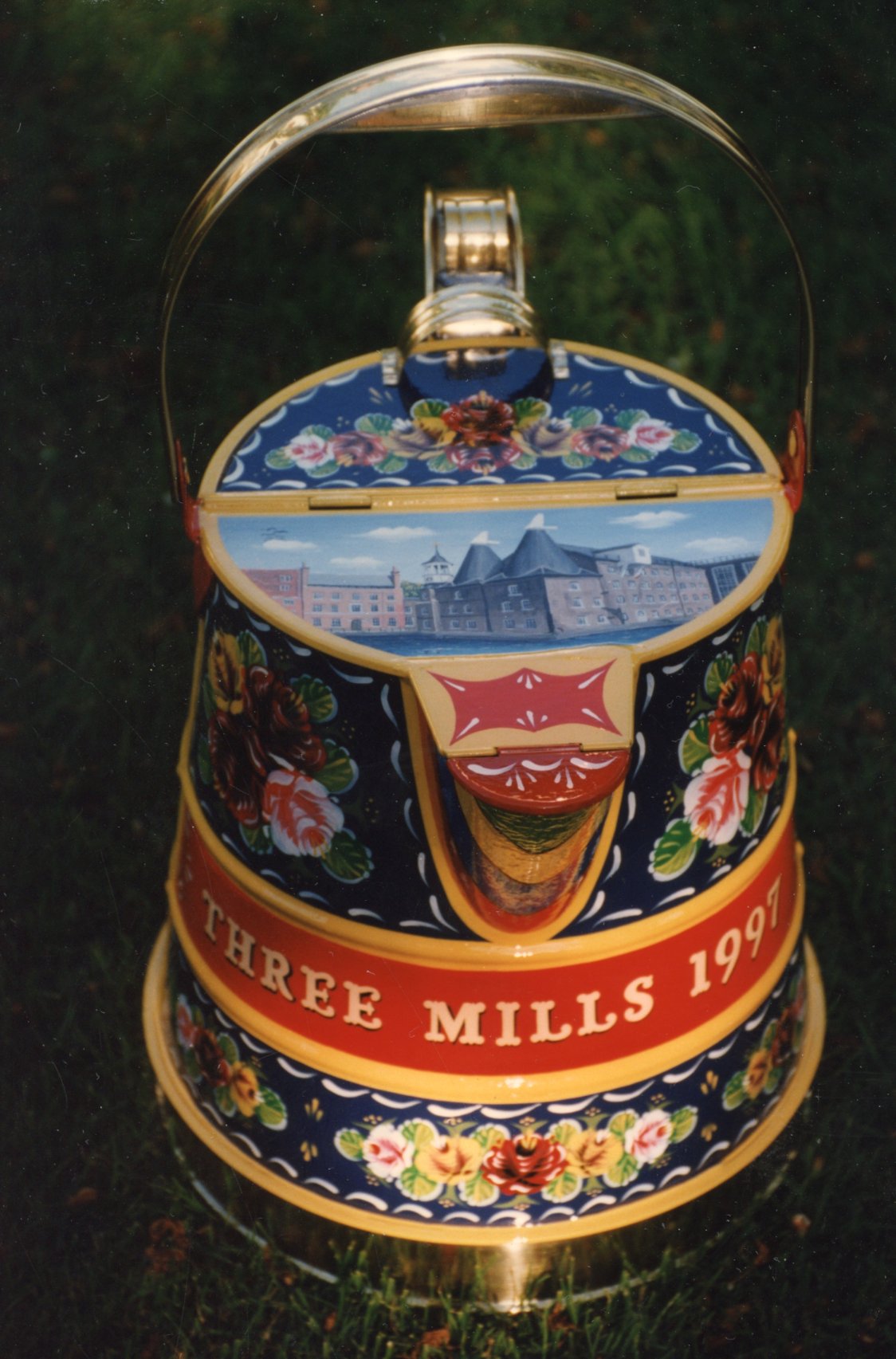
The picture in the centre shows a water can I decorated for a prize at the 1997 waterways festival at Three Mills in East London. The castle picture was replaced with a picture that shows one of the mills in the centre and another on the fare left. The third had been demolished.
I liked trying designs in different colour scheme and then I would say the style was based of 'Canal Art'. This was a 'one off' painted for fun.
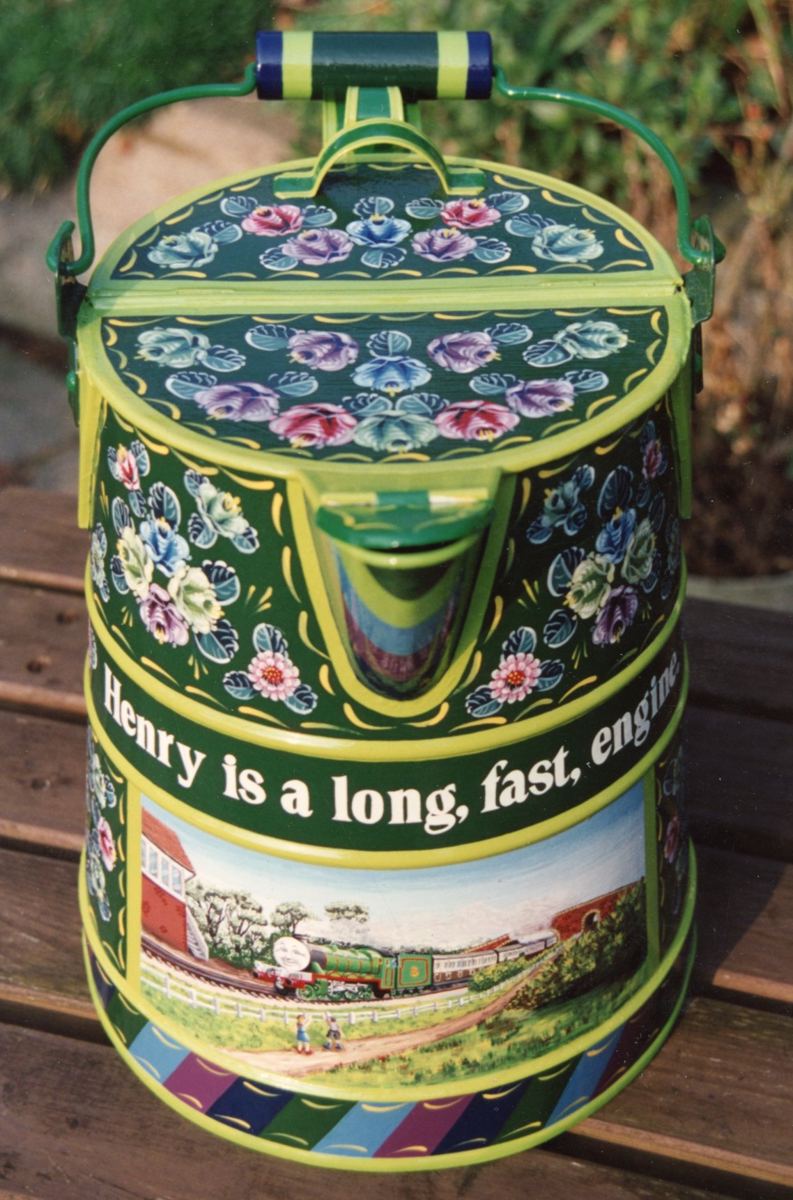
The picture in the centre shows a water can I painted in the early 1990s and ended up being bought for use in a Gypsy Caravan.
The picture on the right shows a water can that was decorated to became a prize at the 1999 waterways festival at Three Mills in East London. The castle picture was replaced with a map to show were Three Mills was in relation to the Thames. I believe this was the last year of the event.
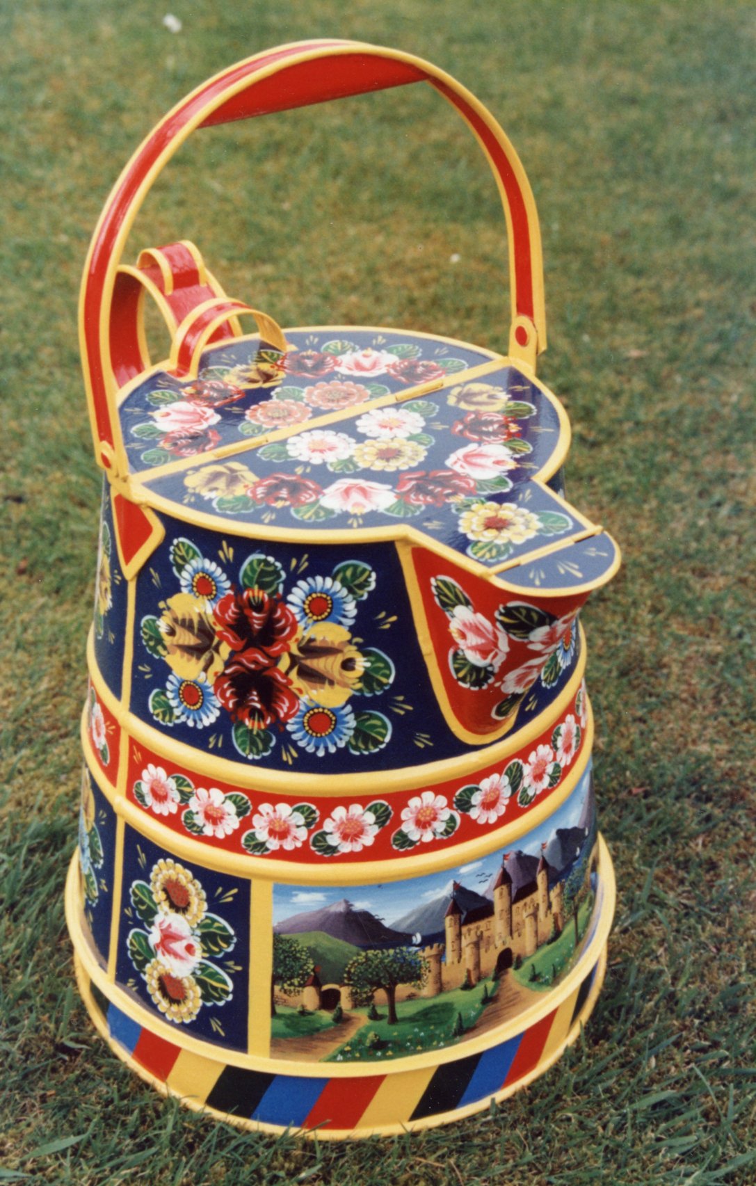
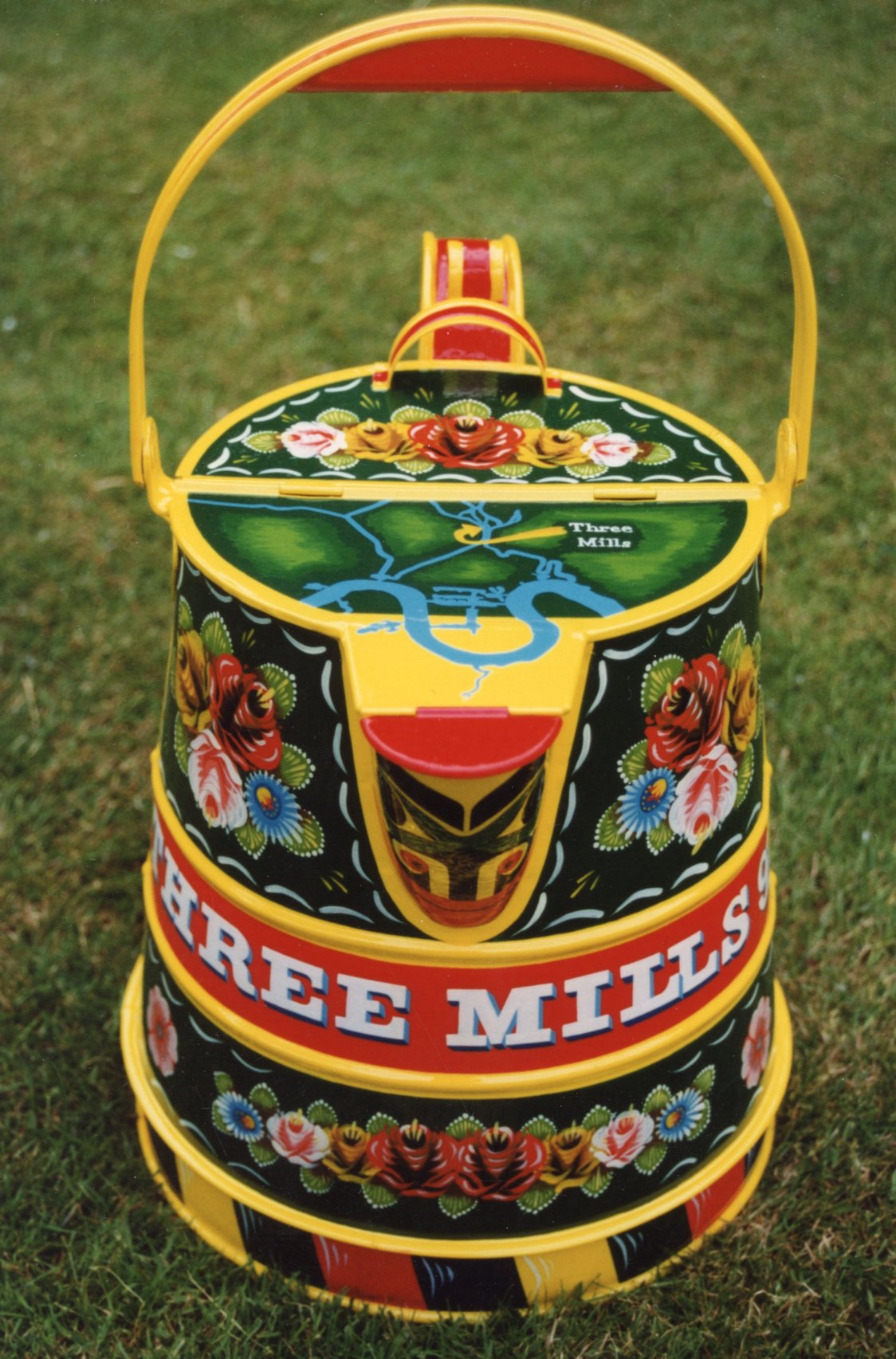
The picture in the centre shows the first water can I painted where the panels were painted with scolloped edges. This is from 2017. You may also note that I keep changing the style off 'castle picture' I use.
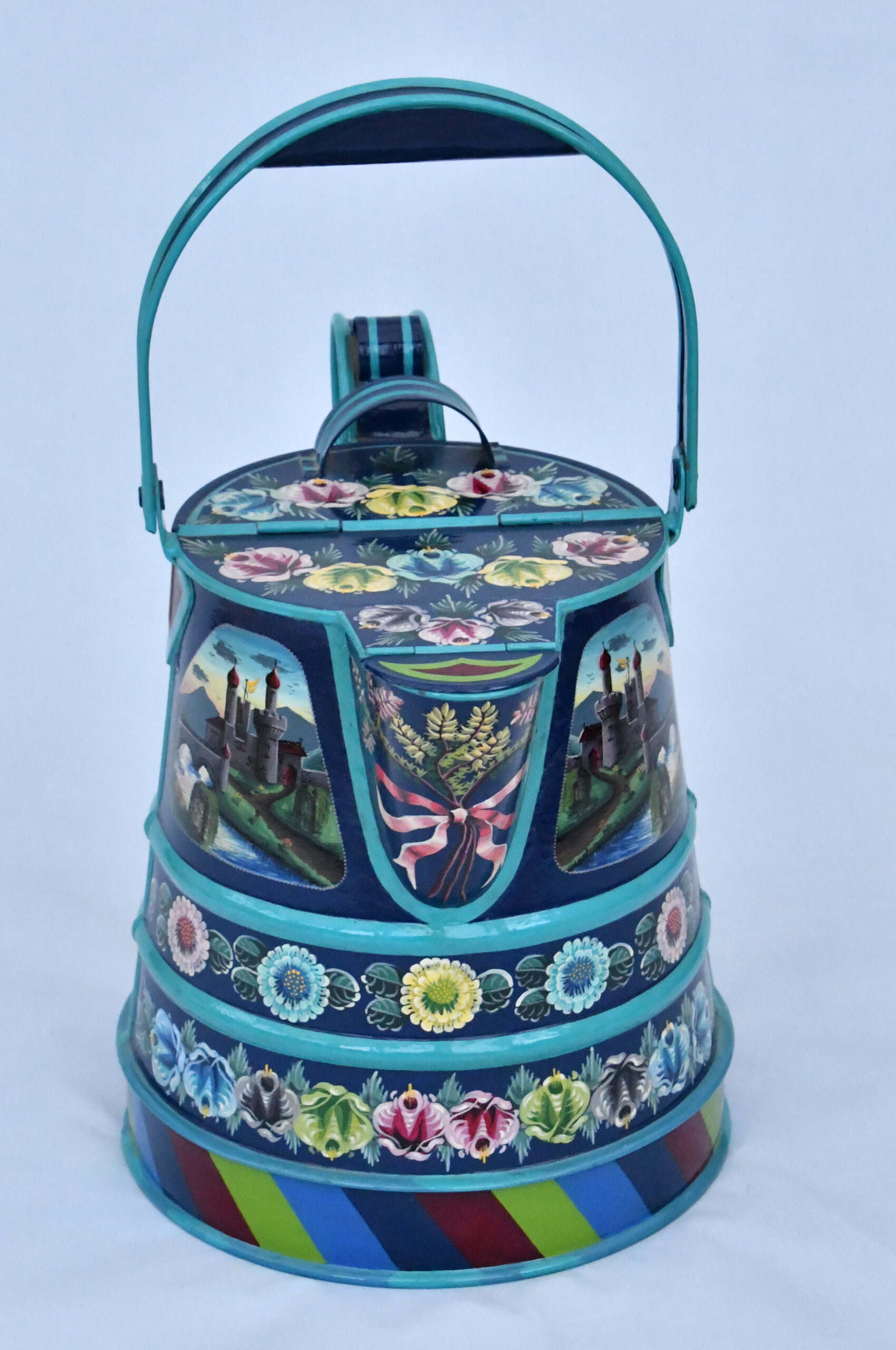
The picture on the right shows the only water can I have painted with a blue theme. The castle picture was set a sunset and I painted twice, one as a mirror images of the other.
